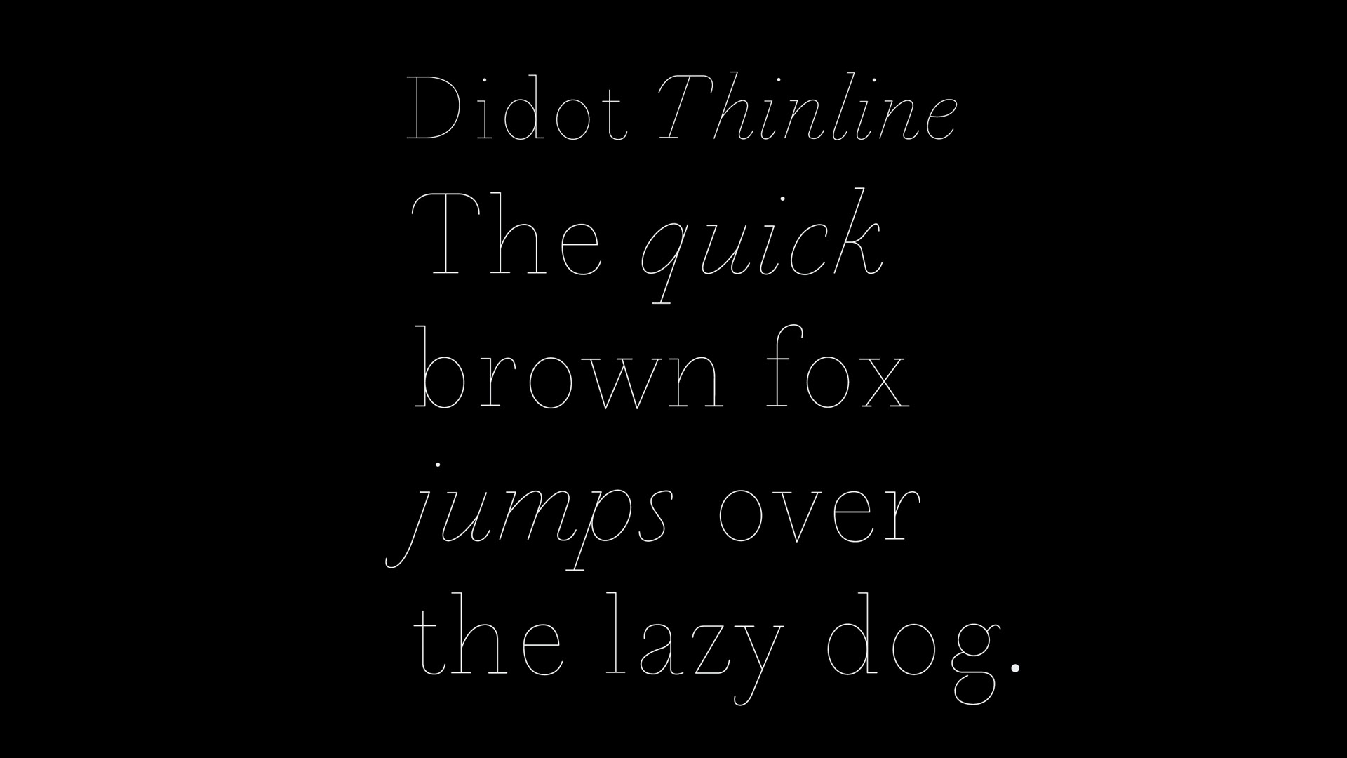
Didot Thinline
Graphic Design
A typeface concept design based around the structure of Didot (1784–1811).
Year
2006-2007
Studio
Personal
My role
Visual Designer
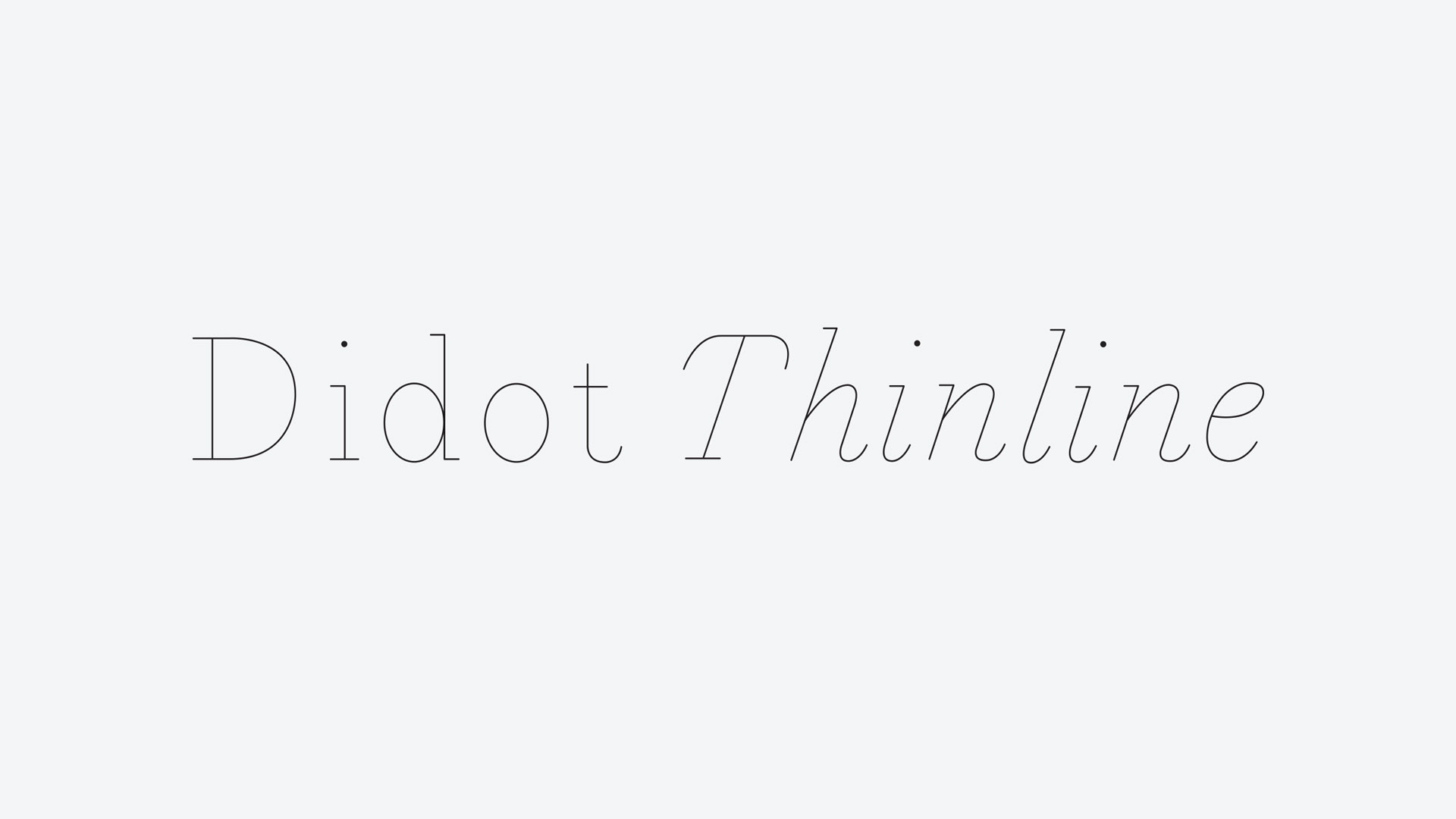
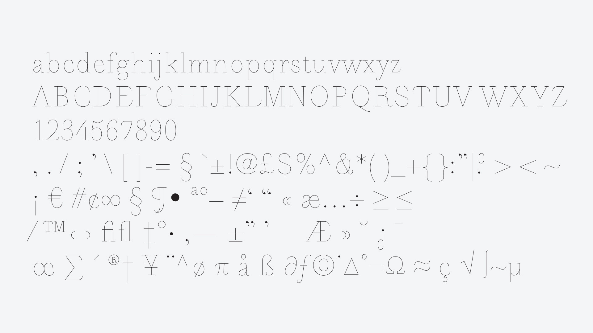
I wanted to create a hairline monoline weight of Didot but struggled with how to incorporate the tapered serifs of the font. I decided to follow the core 'skeleton' of the typeface, deviating only where the serifs terminate, following the curved inner line. The result is a thinline typeface with some interesting quirks, particularly on the upper case characters such as E, F, L, T and Z.
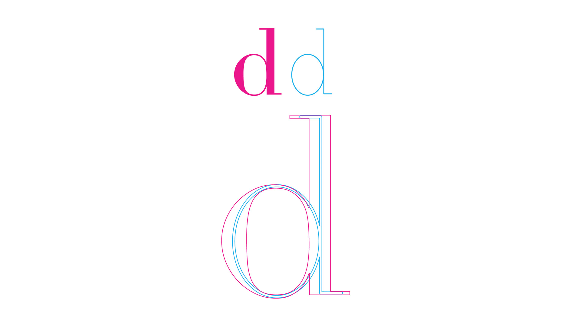
A diagram showing how design and construction choices were made in comparison to the original Didot typeface.
Other projects
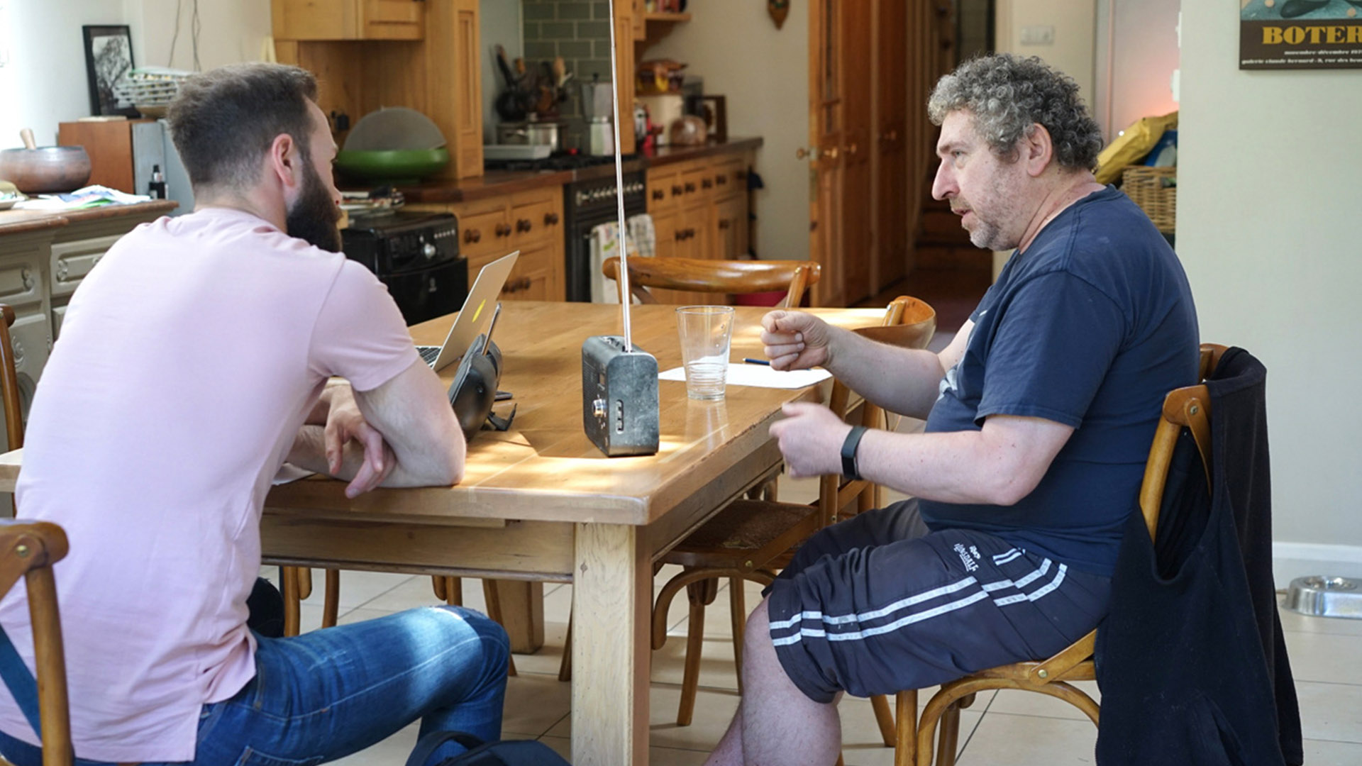
Roberts RadioResearch & Insights, Brand/Product Strategy

Gjensidige Mobile BankResearch & Insights, Product Design

EVRY Strategic Design LabCapability building, Research & Insights
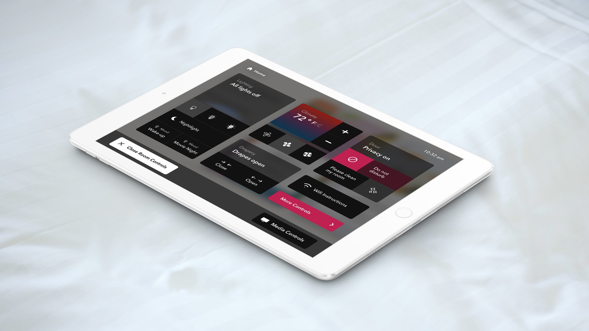
Wynn Resorts – In-room controlsExperience Design, Service Design

Kenwood Universal UIExperience Design

NightingaleExperience Design
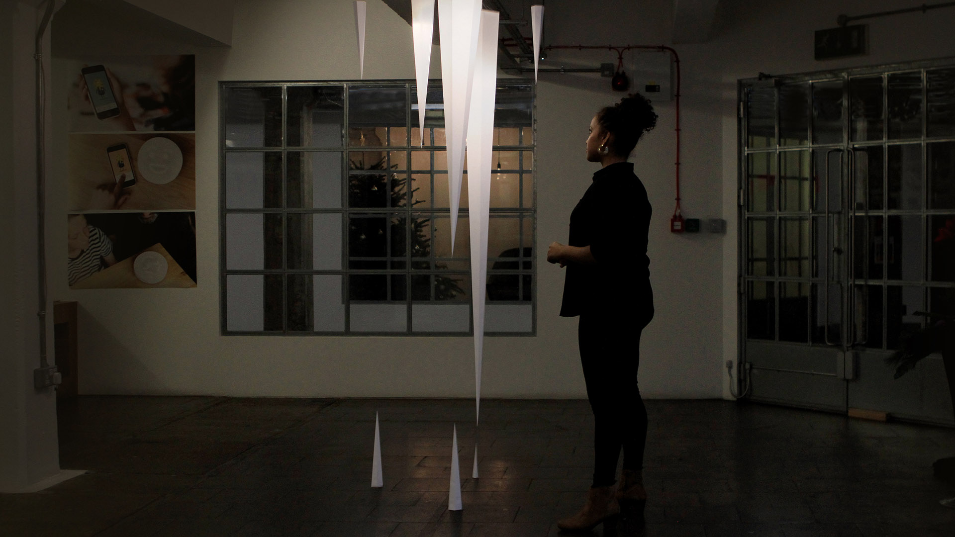
Method Icicle InstallationExperience Design
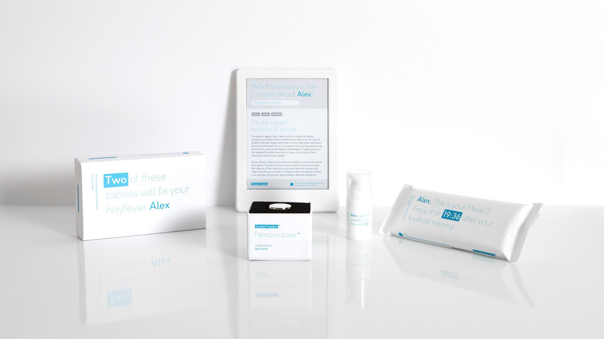
Hitachi – The Future of TrustSpeculative Design
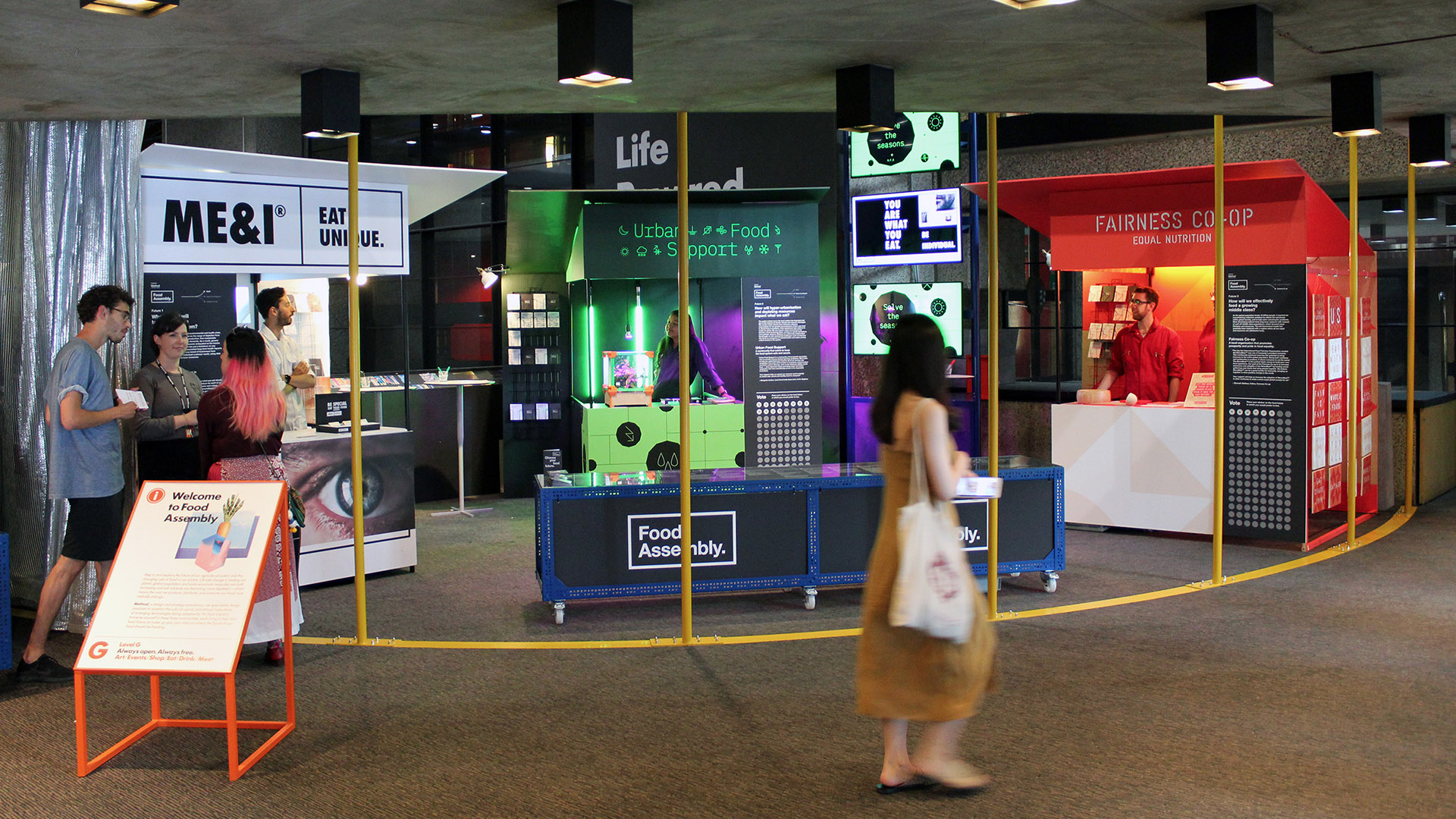
Barbican – The Future of FoodSpeculative Design
Dunhill Brand IdentityBrand Design
DAZN identBrand Design

UKTV BrandingBrand Design
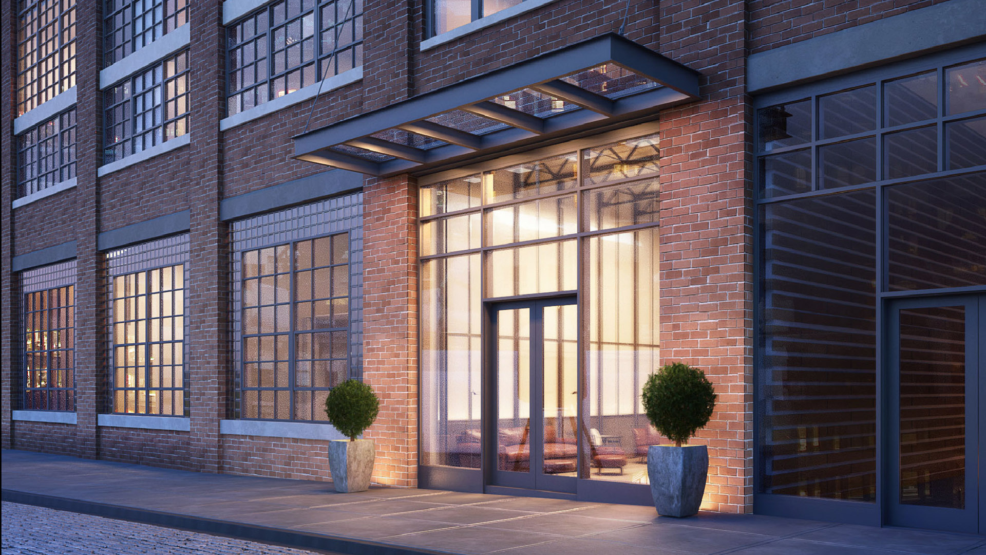
51 Jay Street BrandingBrand Design
JW Marriott Venice F&BBrand Design
Freshfields Brand IdentityBrand Design
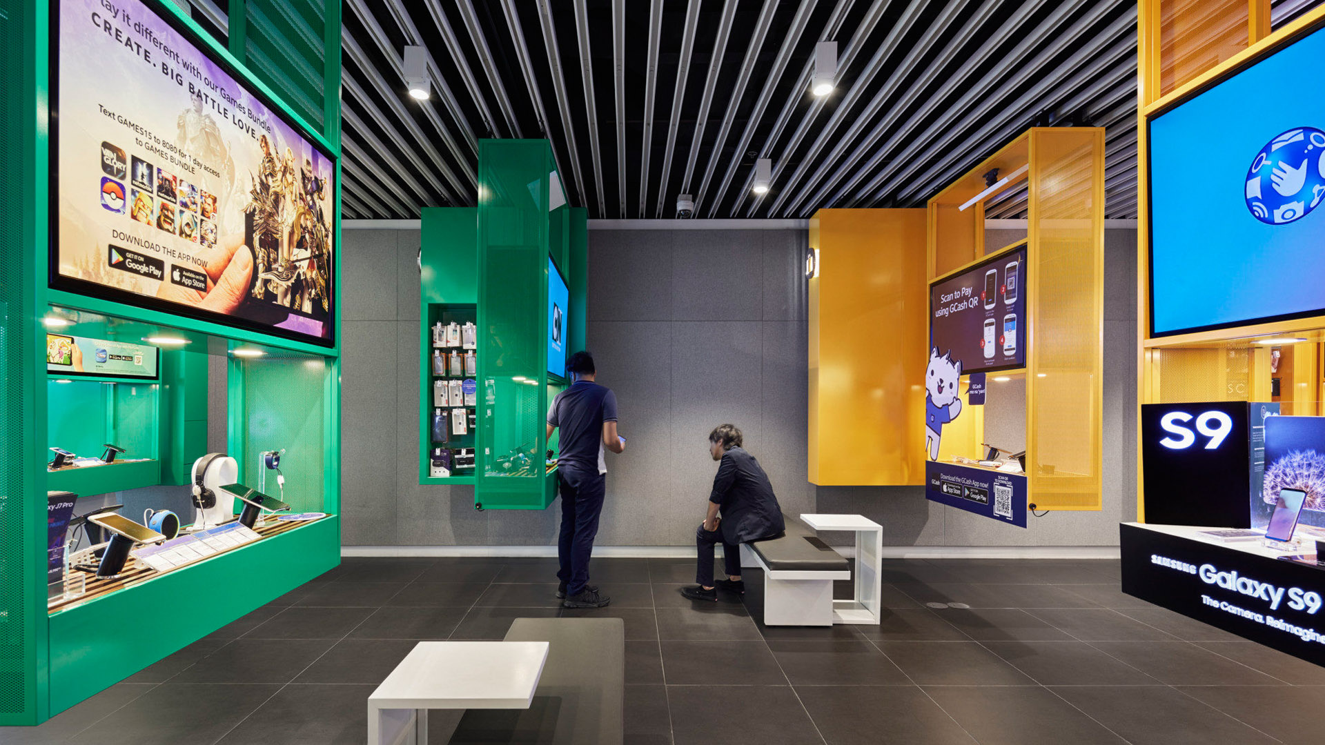
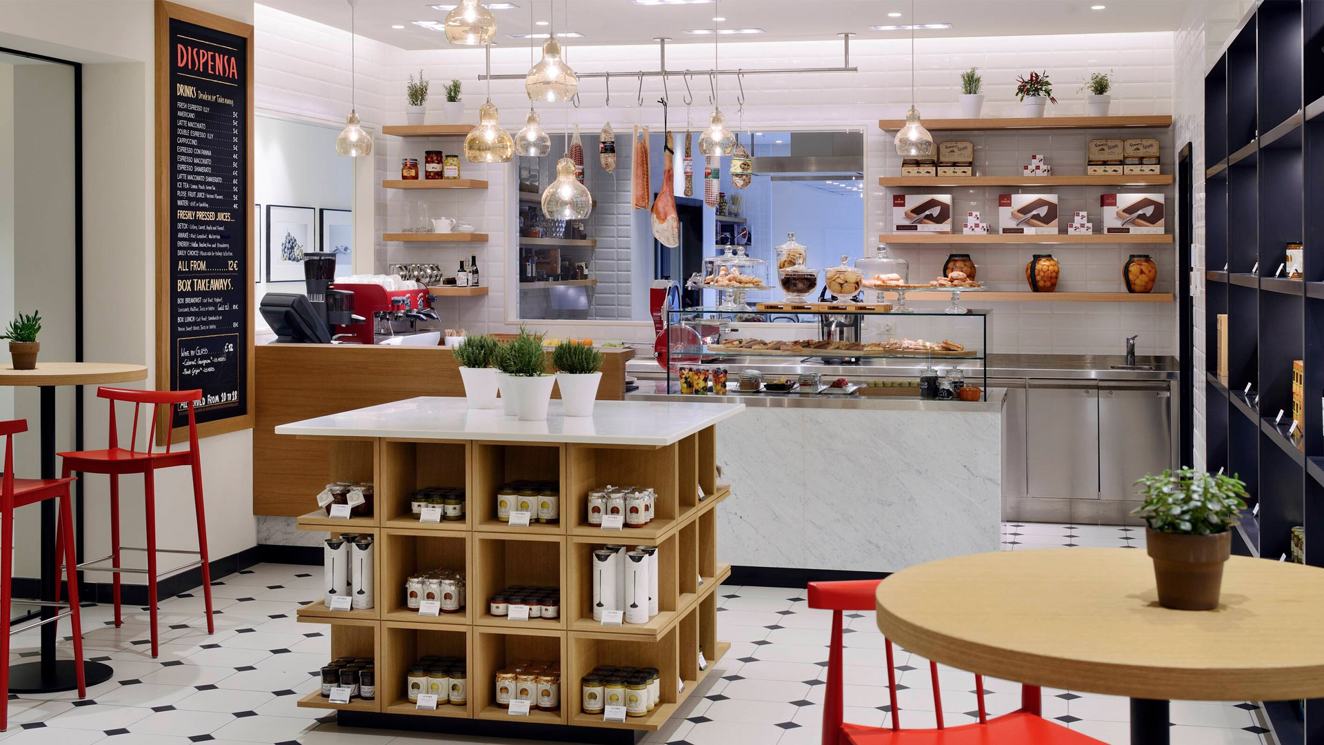
Globe Telecom Flagship storeEnvironmental Design
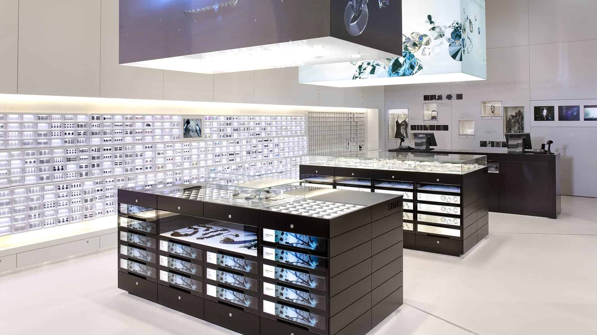
Swarovski Crystallized StoreEnvironmental Design
Peter Gregson Album CoversGraphic Design
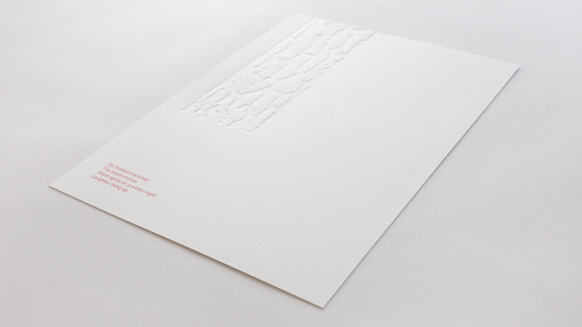
Sensory Holiday CardGraphic Design
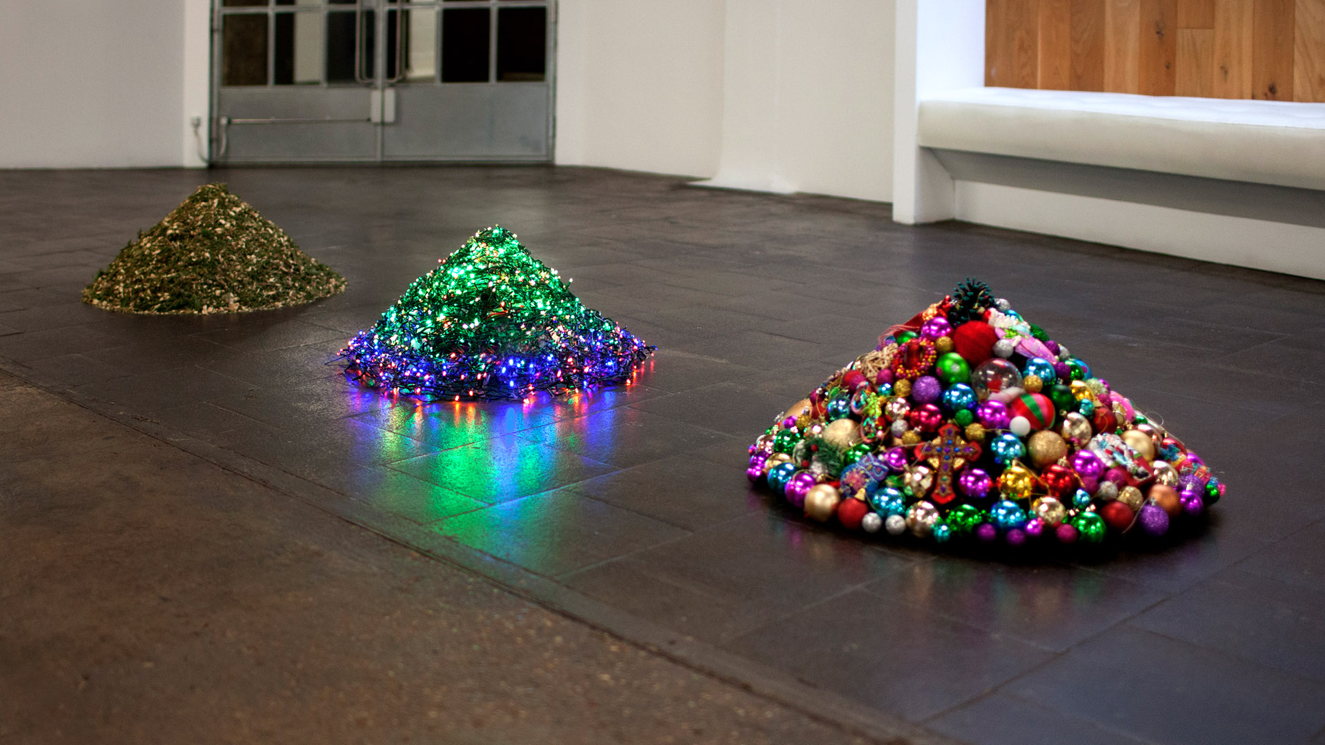
Decontstructed Christmas TreeGraphic Design
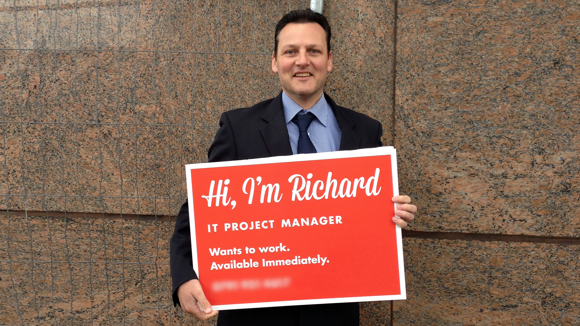
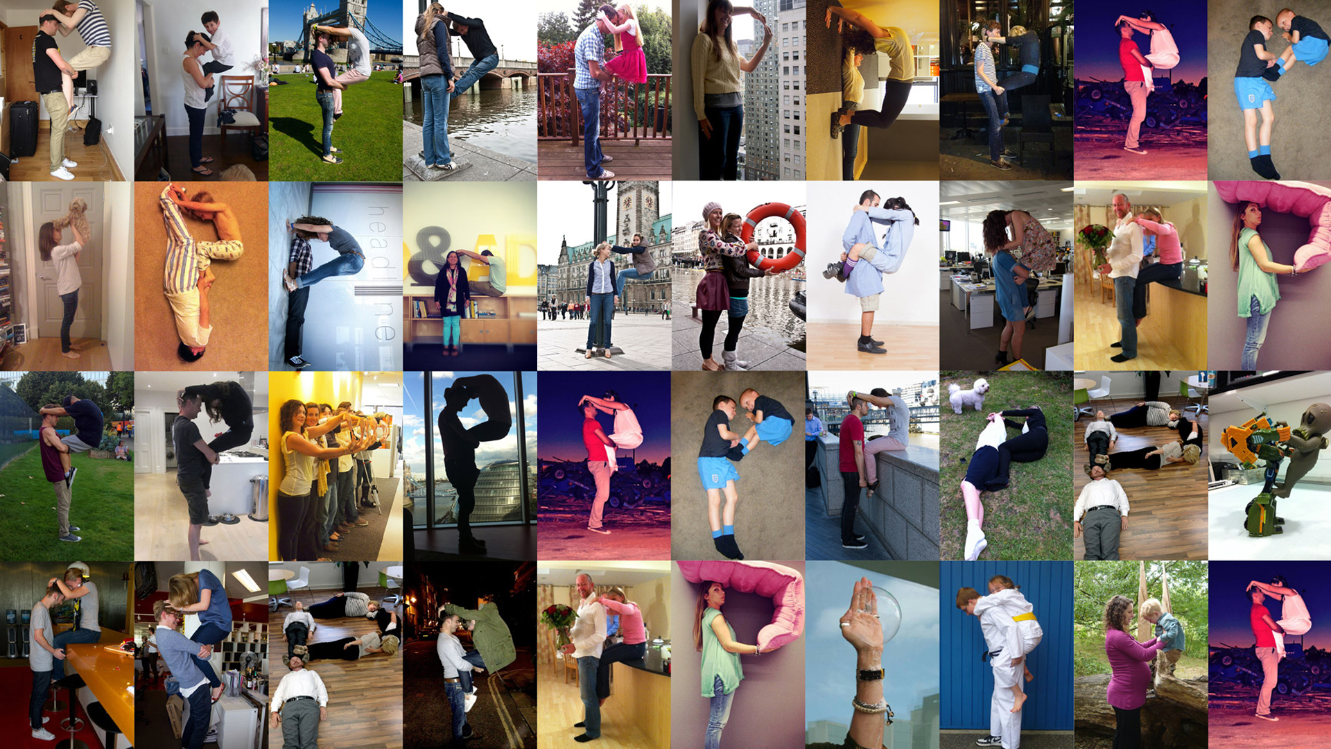
Richard's SignGraphic Design
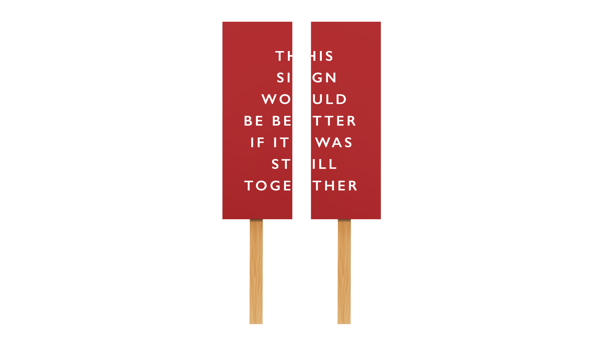
Anti Brexit protest signGraphic Design
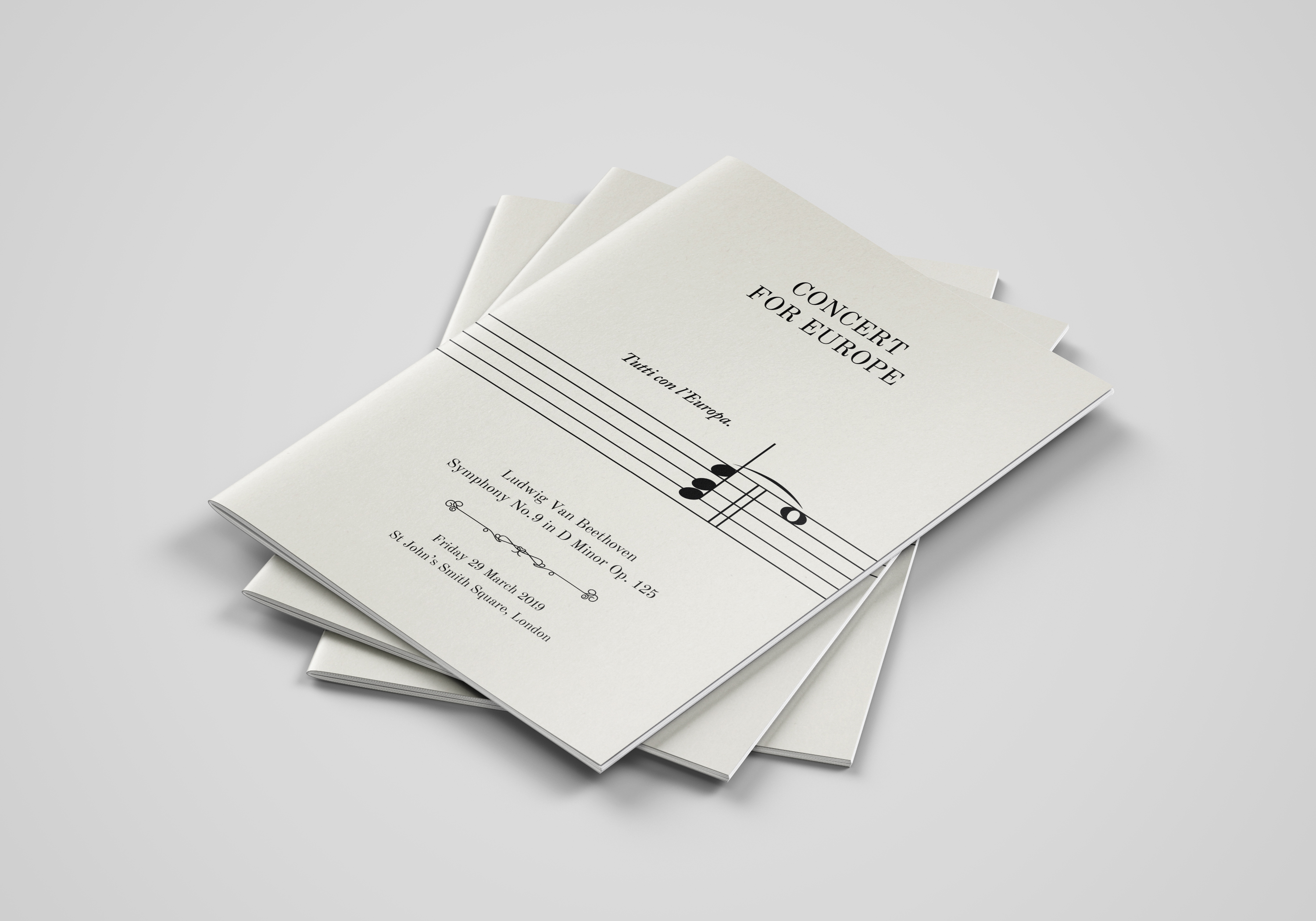
Concert for EuropeGraphic Design
Peace One DayBrand Design
Ten Bells PubPhotography
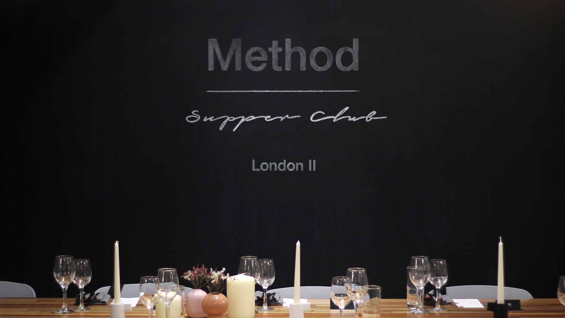
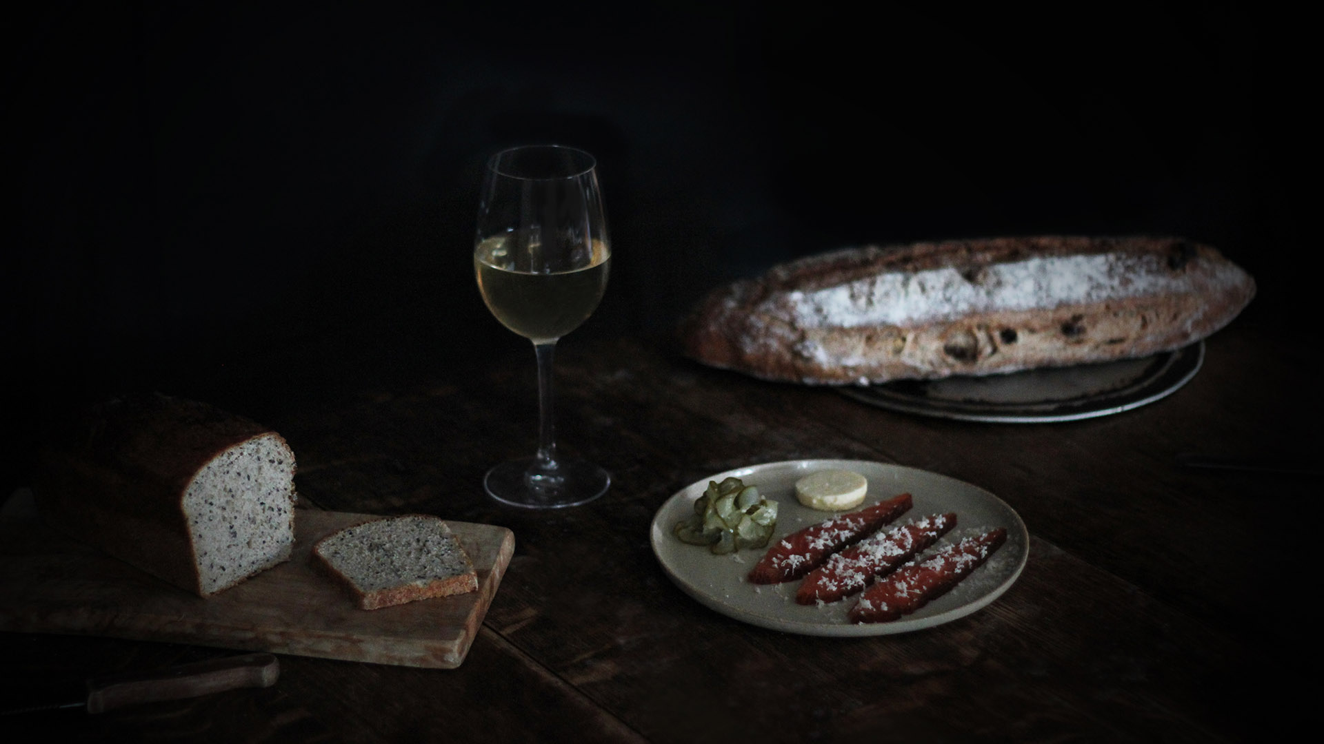
Method Supper ClubPhotography
Joshua Leigh
Contact
©2019