Kenwood Universal UI
Experience Design
We were commissioned by Kenwood to create design principles for a universal user interface, shaping the future of connected appliances in the kitchen.
The Kenwood Cooking Chef which features the interface developed in this project won both a Red Dot Design Award 2020 and an iF Design Award 2021.
Year
2017
Studio
Method
My role
Lead Visual Designer


Background
Kenwood has led the way in kitchen appliances since 1947. It had become clear that the traditional mechanical interfaces needed to be augmented with a digital UI to link them to a wider connected ecosystem in the home.

From the outset, we were conscious that the kitchen context is a unique environment within which to place a digital interaction. Kitchens engage all of the senses – they’re messy, wet, hot and potentially full of hazards.
Technology in the kitchen has frequently been designed in the engineer’s image and not that of the chef. What do the numbers on a toaster mean? How toasted is 2 versus 4? What the user really wants is to see and smell the bread and judge for themselves.
Interaction model
Through observing chefs in action, we realised that the food itself is the primary point of interaction. The ingredients provide feedback to the chef through their changes of state – consistency, colour, smell, taste. This is ultimately what the user is interested in. Our understanding of this shaped our approach to designing a digital interface specific to food preparation.
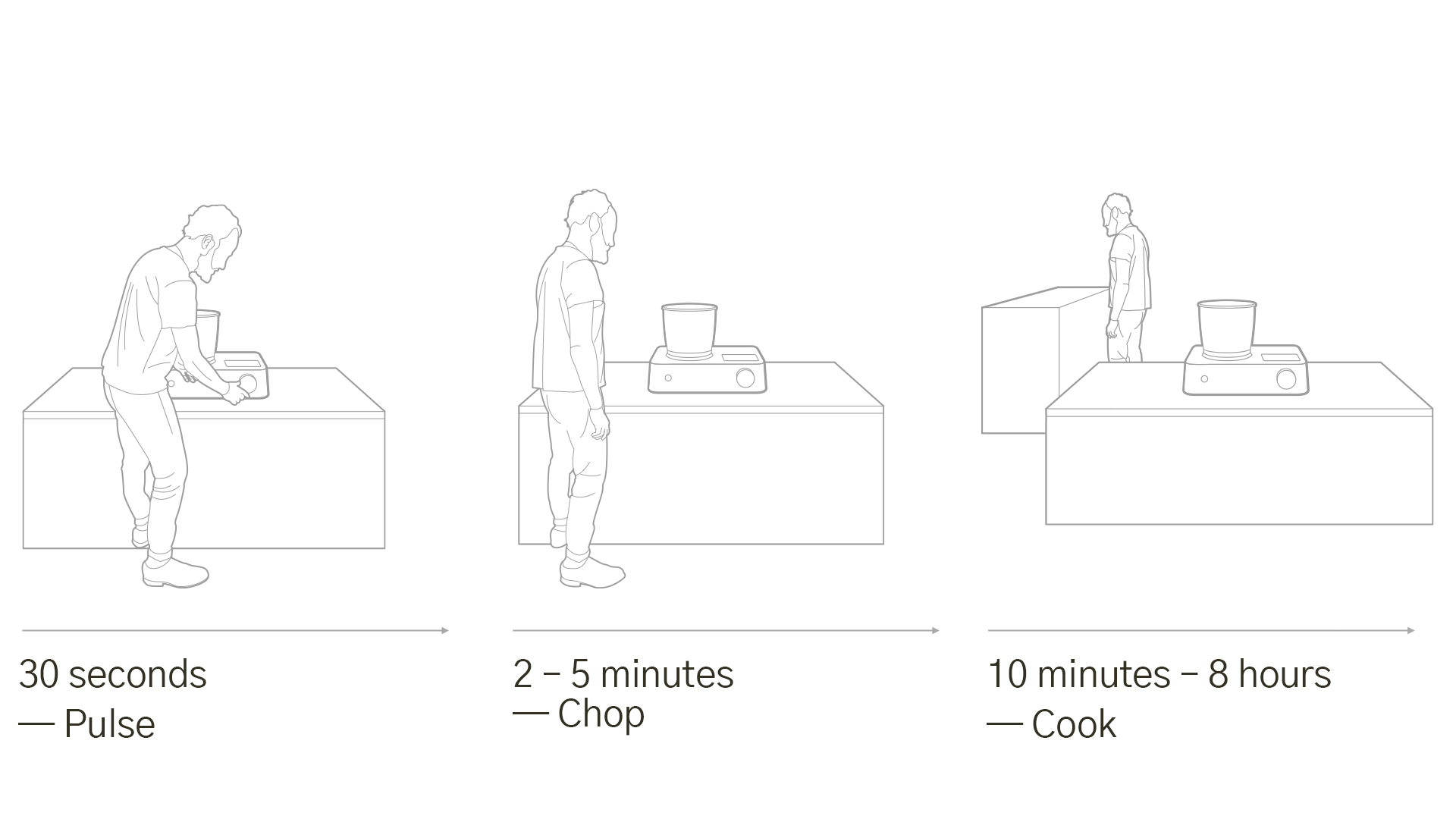
We developed an interaction model which takes into account 3 types of temporal user engagement. We understood that cooking involves multitasking. The cook is not always present in front of a cooking appliance at all times. The interface needed to provide appropriate feedback depending on the length of the user's engagement.
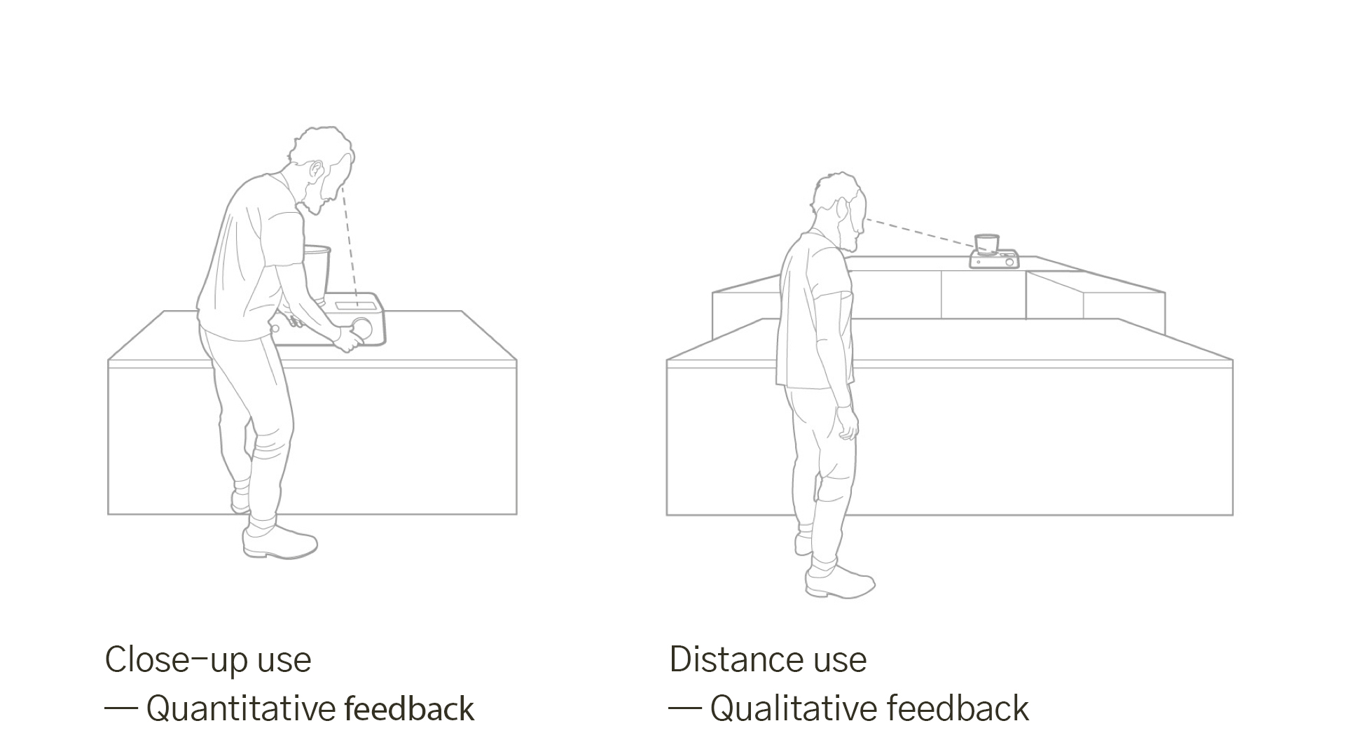
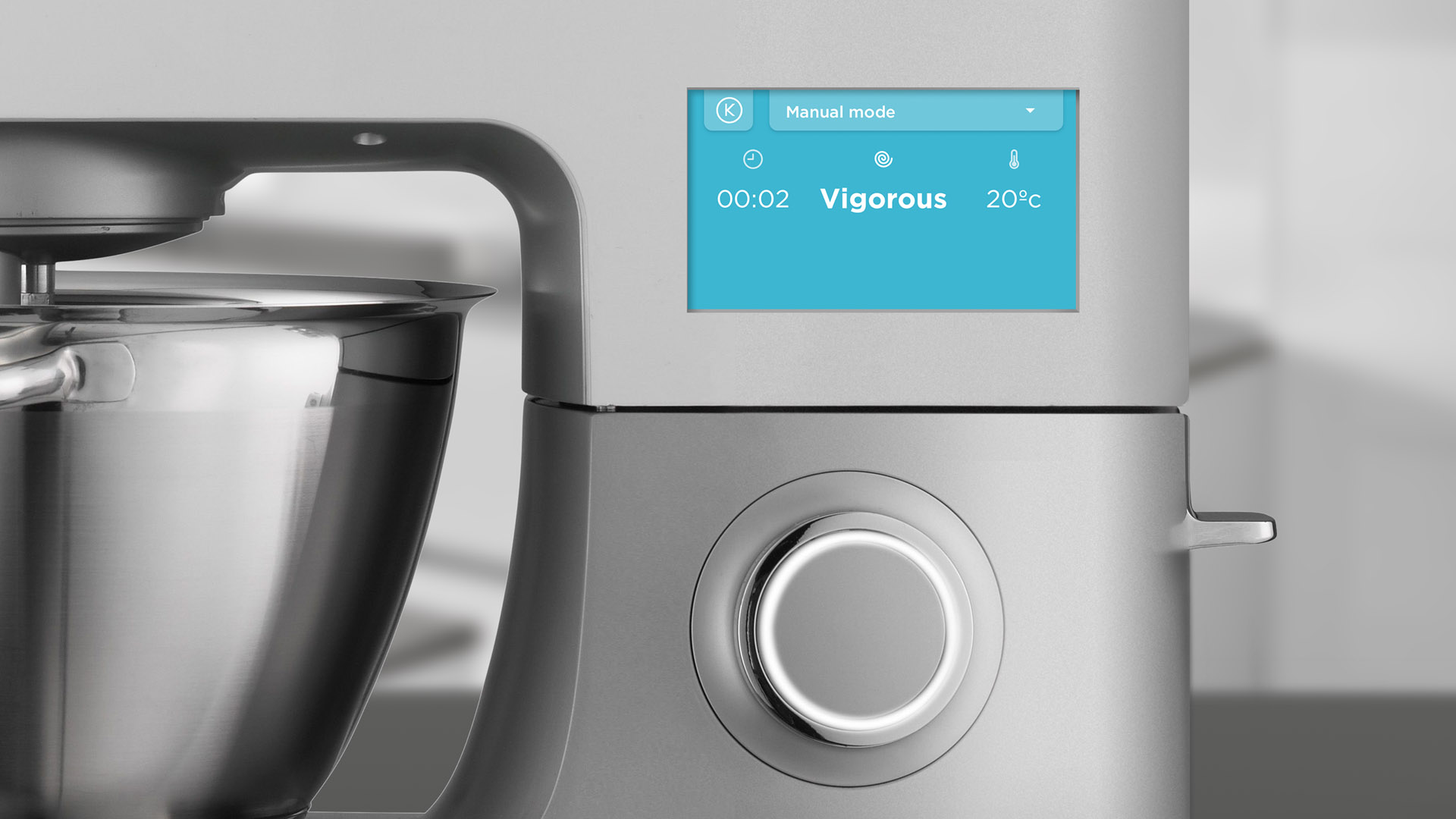
The interface also acknowledges that a chef rarely stands still watching an appliance, so it is designed to provide useful visual feedback from a range of distances, for example the background colour of the interface denotes the temperature of the appliance. If the user is too far away to read the numerical temperature on the display (quantitative), they can still see a warm, orange colour from a distance and receive feedback on heat (qualitative).
Interface design
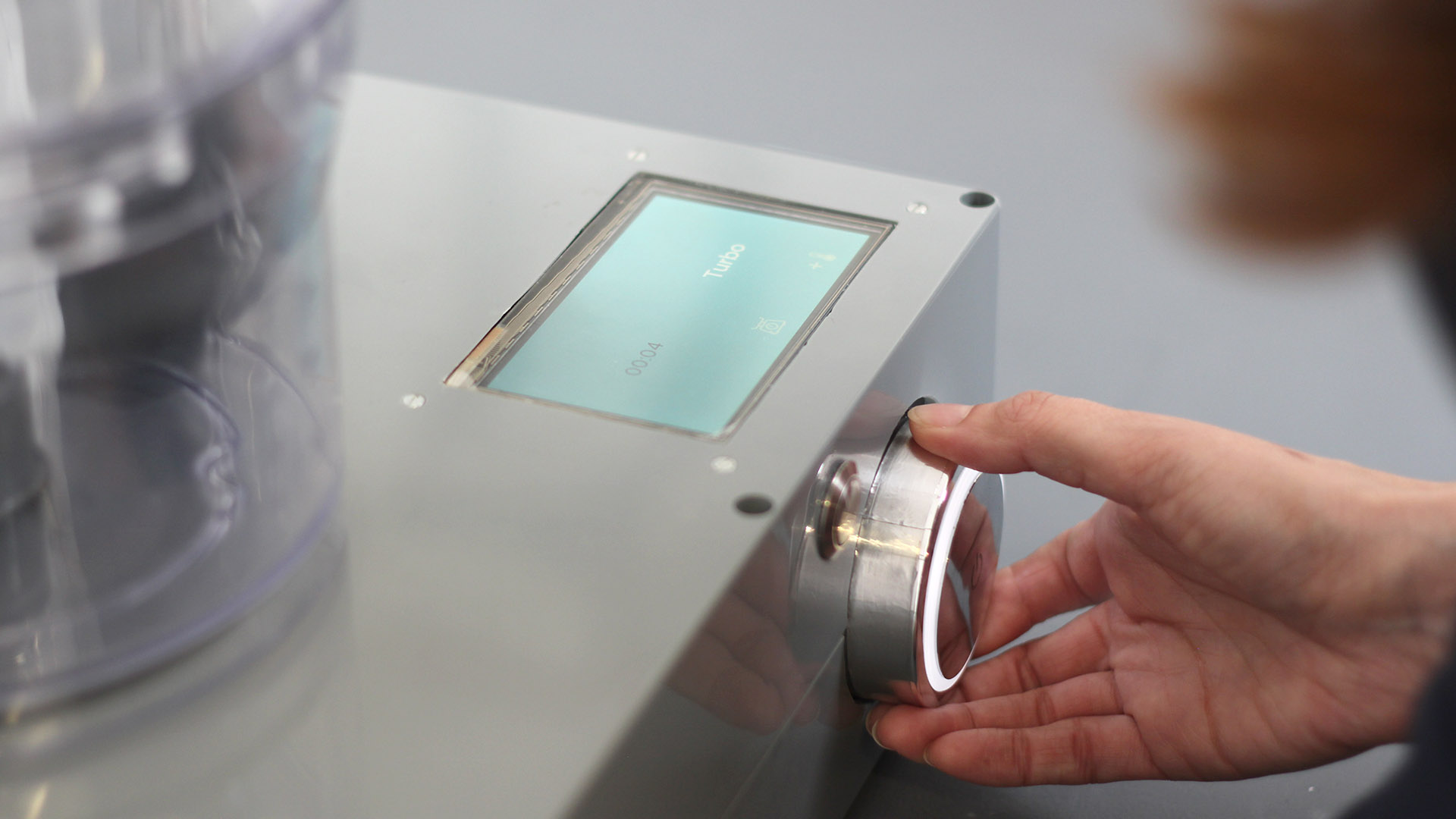
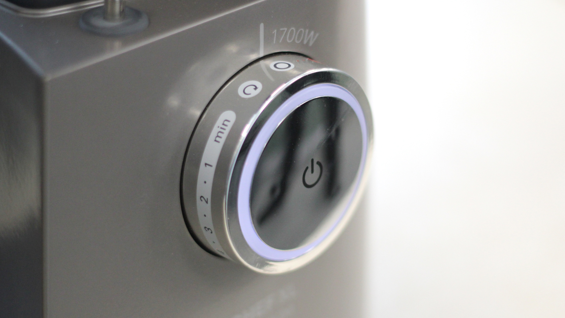
Our interface was designed to support the physical controls of the kitchen appliance, knowing that touchscreens and wet, food covered fingers don’t mix.
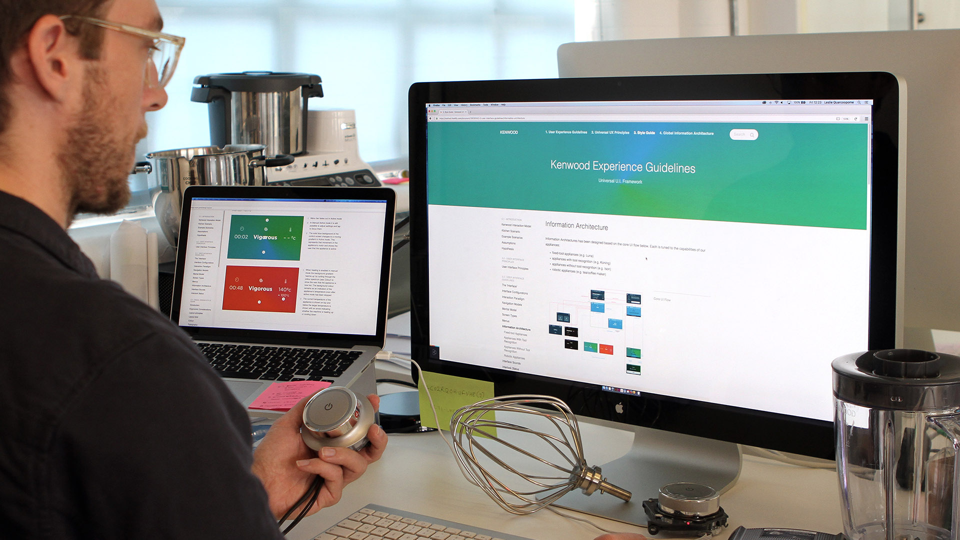
The feedback of the interface was created to add meaning to the controls of the appliance. Our controls use intuitive language to communicate the intent of the chef – ‘gentle’ or ‘vigorous’ instead of speeds 2 and 4.
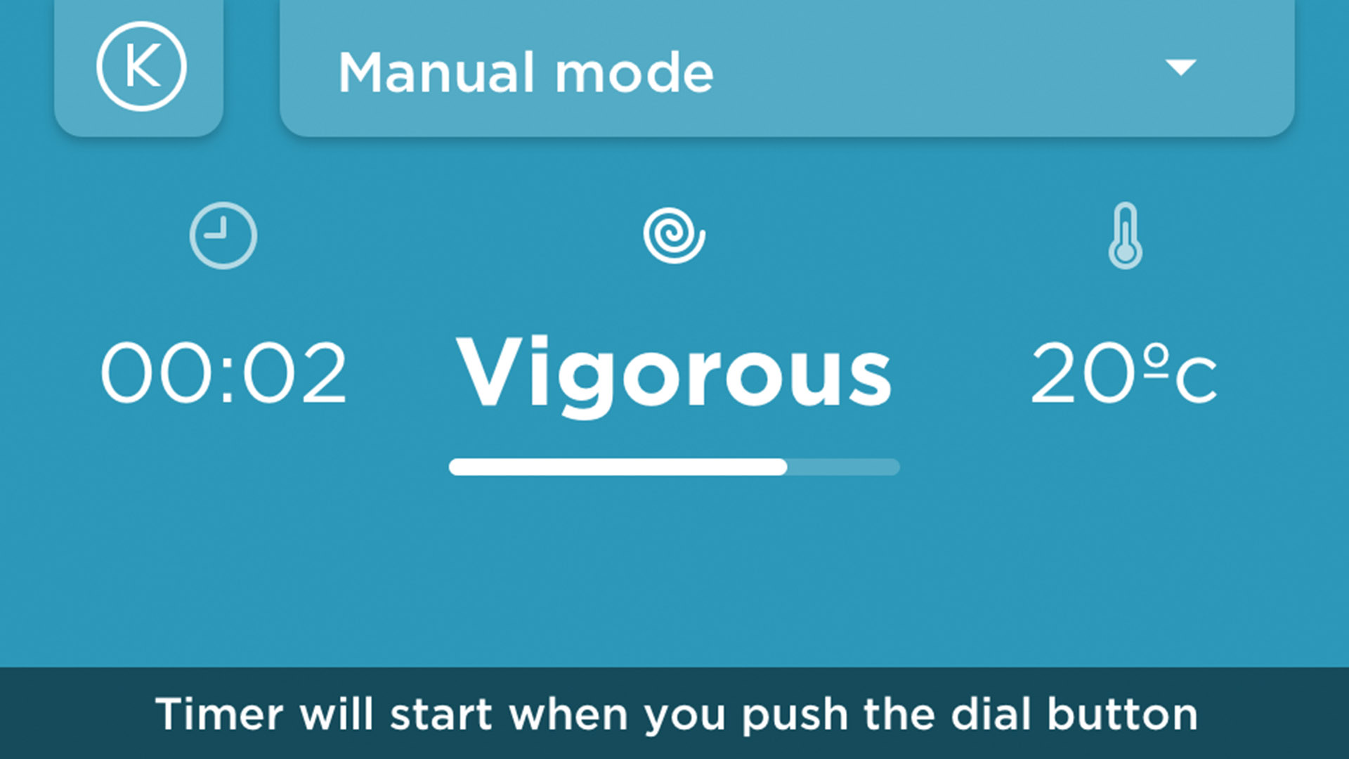
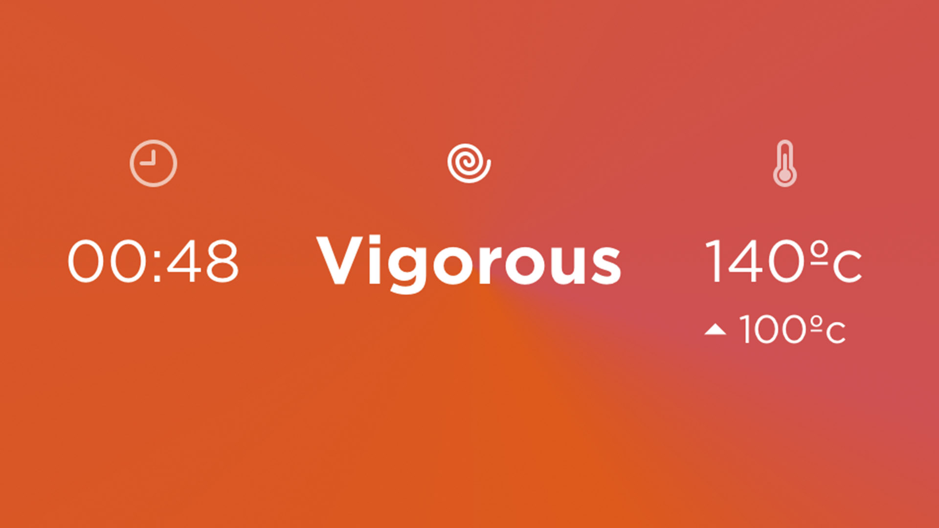
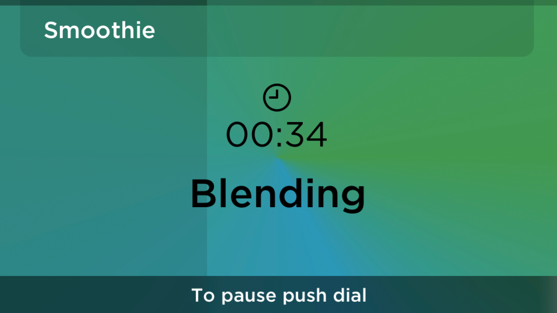
The foreground of the interface provides quantitative feedback in the about a process being undertaken. The background provides qualitative information about the state of the system which is visible at a distance. The colour of the background represents the temperature state of the appliance (moving from a cool blue through to a hot red as the appliance heats up). A shadowed progress bar on top of the background colour shows the remaining time on a preset programme, also visible at a distance from the appliance.
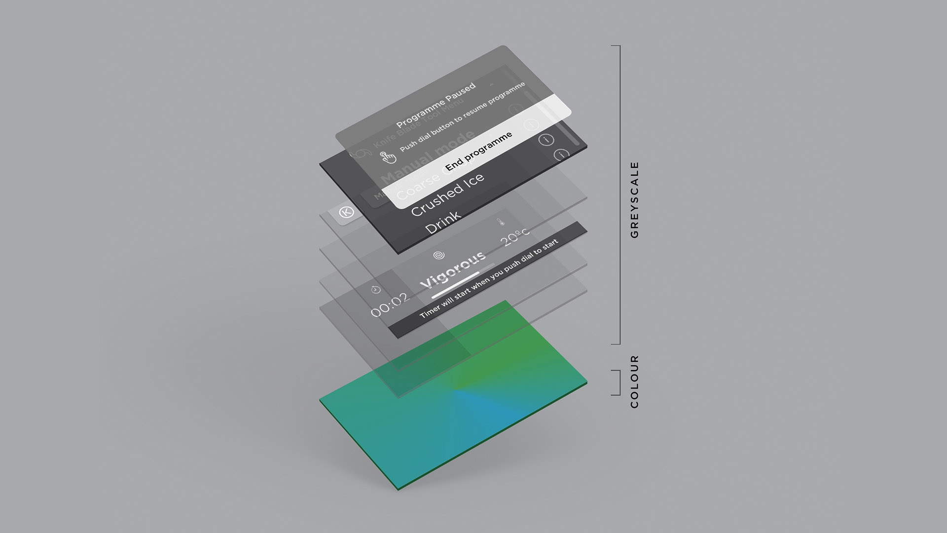
All of the elements in interface were designed as greyscale components with varying degrees of transparency. Colour was reserved purely for the function of denoting the temperature state of the appliance. This allows the background colour to permeate through all interface elements, whilst retaining contrast for accessibilty.
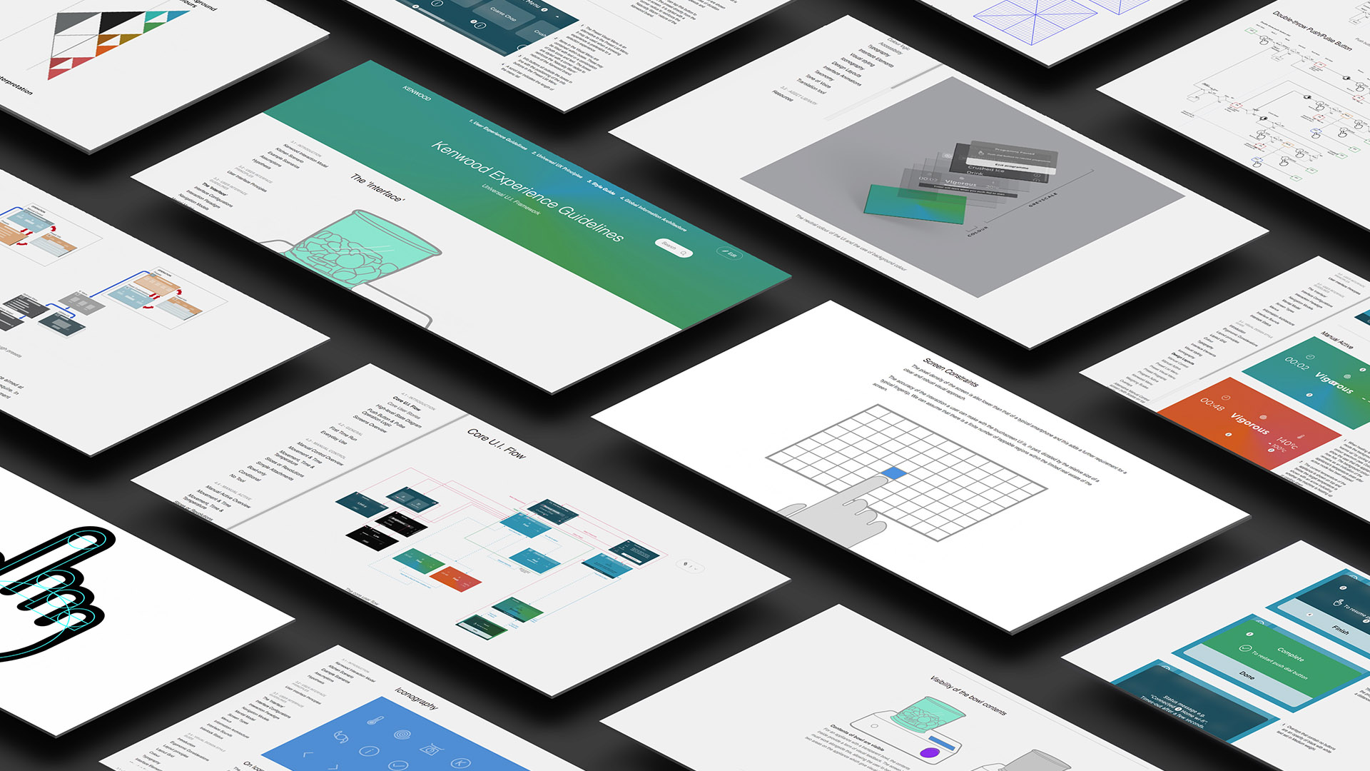
This systematic and detailed approach was documented in comprehensive design guidelines. The guidelines were delivered as an online style guide, devised as a living document and resource for engineers and designers within Kenwood.
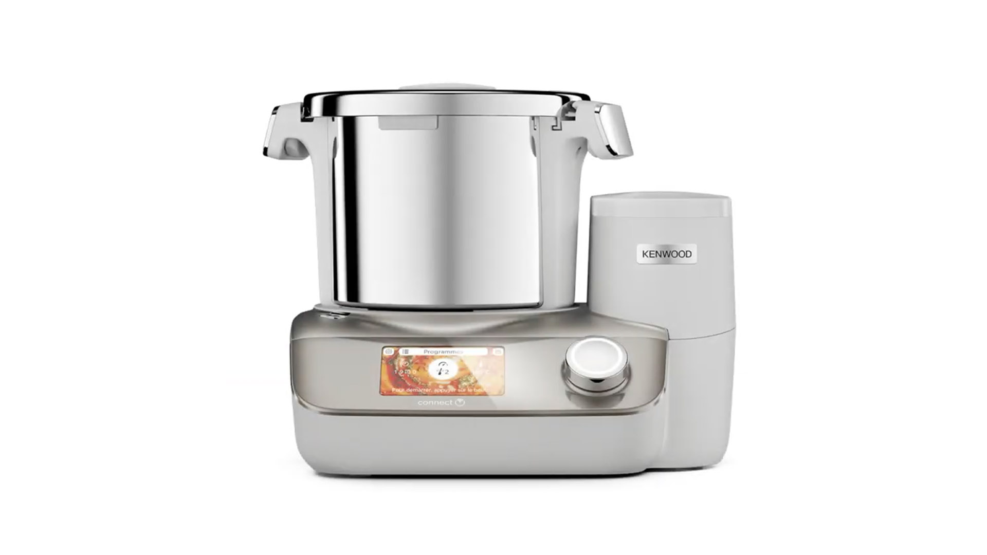
The Kenwood Cookeasy+ launched in September 2019,
it was the first product to feature the universal user interface.
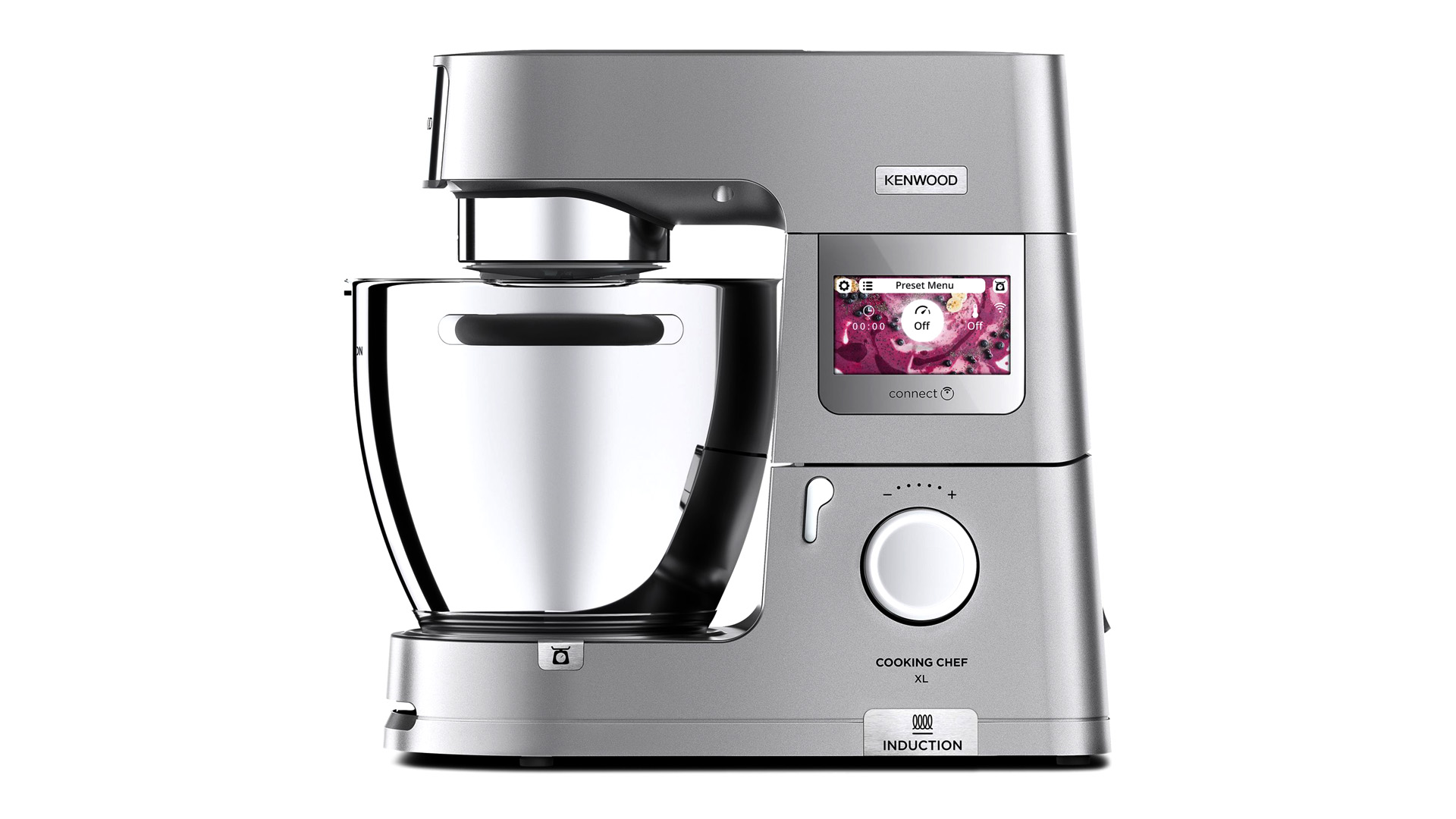
The Kenwood Cooking Chef XL launched in October 2020,
it features the universal user interface.
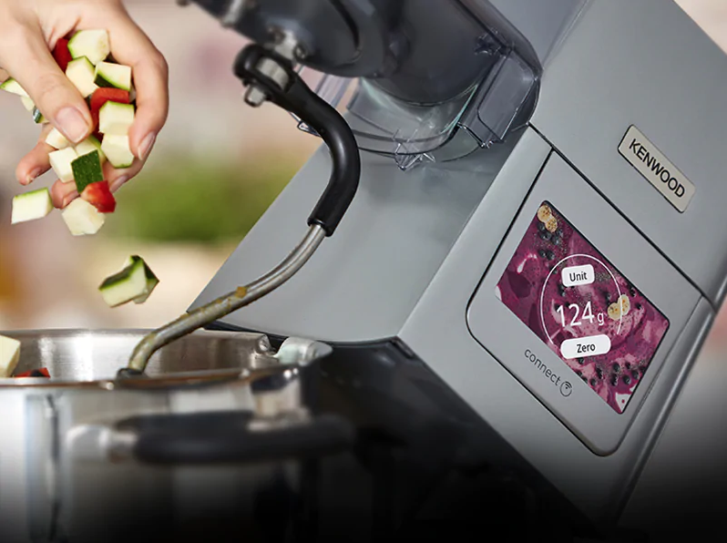
The touchscreen allows for selection of various mixing and cooking presets from the menu.
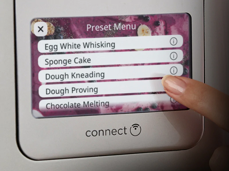
The display also shows the weighing scale and the status of the appliance during mixing and cooking modes.
Promotional video for the Kenwood Cooking Chef XL
Process
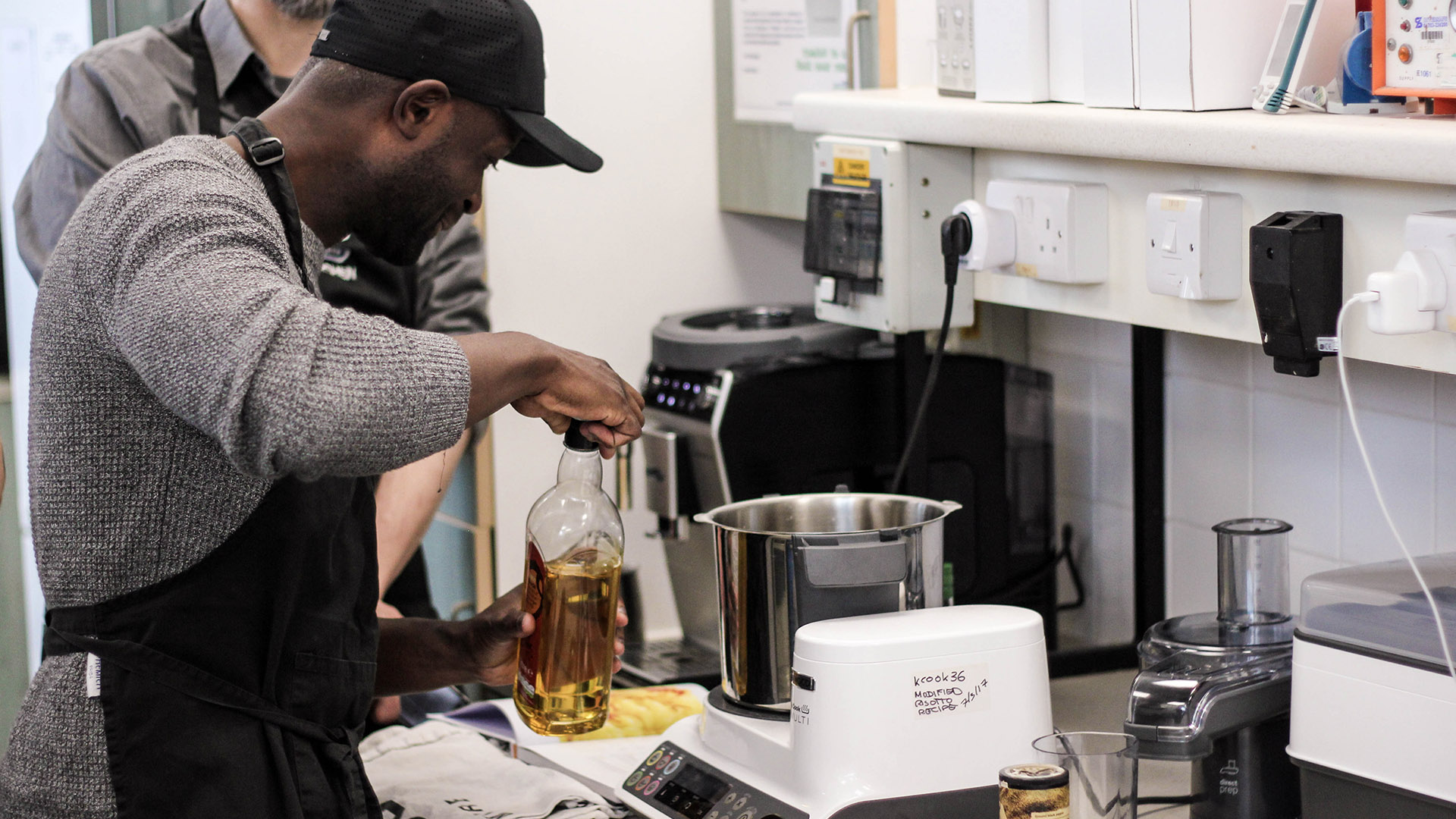
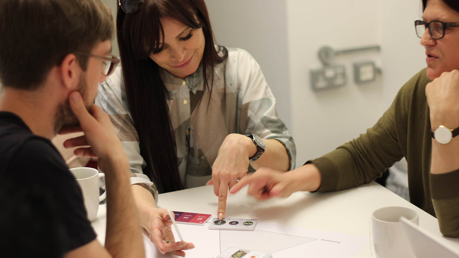
The project began with an immersion session at Kenwood's test kitchen. It quickly became apparent that designing an interface for the messy, hazardous kitchen environment presented a range of unique challenges. The design process required a technical understanding of both the product engineering as well as the limitations of the screen and its board. User validation sessions were run to identify an intuitive interaction model. Later in the project, user testing sessions were conducted to refine the design of the interface.
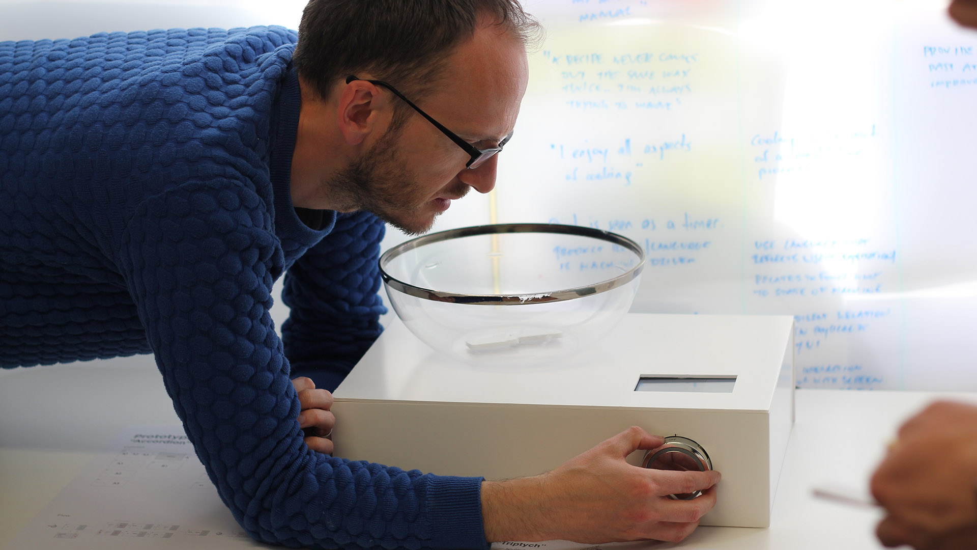
A key insight was that the primary interface for the chef is the bowl or pot in which they are cooking. The food itself provides multi-sensorial feedback via its visual appearance, its smell, taste and even sound. Any UI in this environment needs to complement not distract from the cooking process.
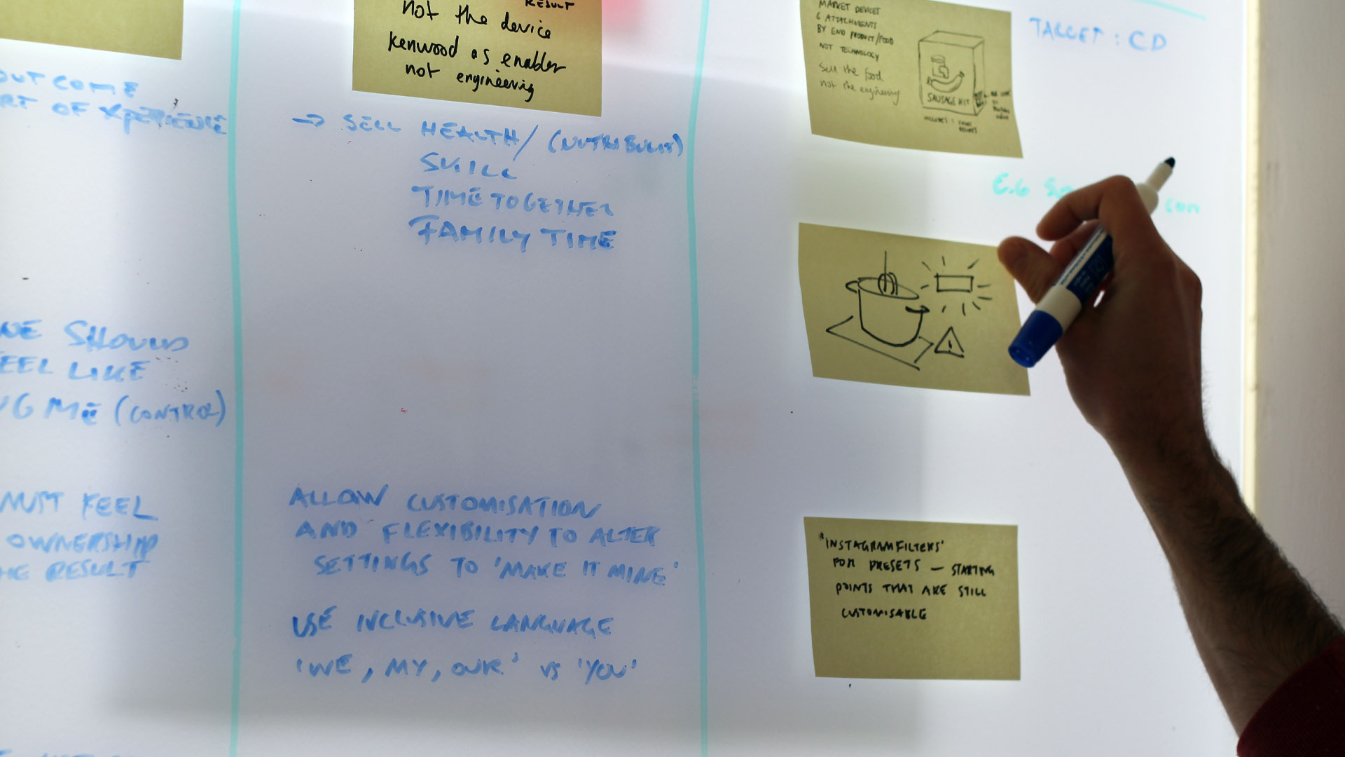
We wrote user stories for key points in the cooking process from preparation through to serving. The stories focused on two key personas which had been identified by Kenwood.
We conducted user validation sessions to gather feedback on interaction models as well as aesthetic directions.
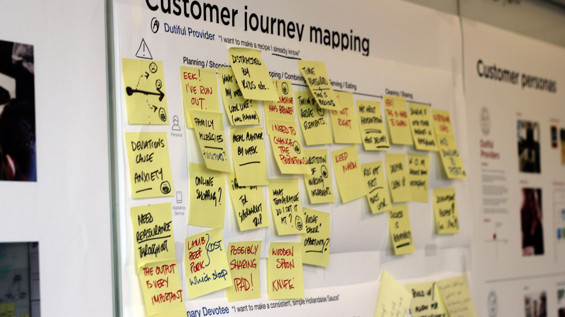
We mapped out customer journeys for the key user personas. These journeys allowed us to understand the points at which the UI should be a primary focus for users and when it should provide more passive feedback.
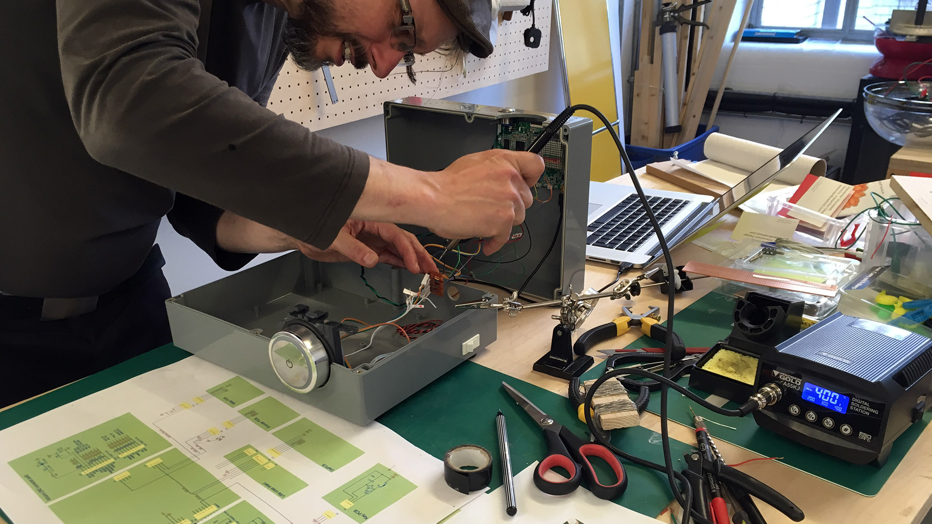
We constructed a number of physical prototypes for our using testing sessions. This was vital in providing user with a realistic experience. The combination of physical controls alongside the touchscreen interface was one of our primary areas of testing.
At every point in the process, stakeholders from within Kenwood were involved in collaborative working sessions as well as user testing. It was important to incorporate feedback from engineering, product design and marketing departments who would all be impacted by the design of the interface.
We authored an online style guide outlining in detail the implications of these UX principles. This was devised as a living document for use throughout the Kenwood organisation to guide decision making and design choices when shaping the future of the Kenwood product range.
Other projects
Roberts RadioResearch & Insights, Brand/Product Strategy
Gjensidige Mobile BankResearch & Insights, Product Design
EVRY Strategic Design LabCapability building, Research & Insights
Wynn Resorts – In-room controlsExperience Design, Service Design

NightingaleExperience Design
Method Icicle InstallationExperience Design
Hitachi – The Future of TrustSpeculative Design
Barbican – The Future of FoodSpeculative Design
Dunhill Brand IdentityBrand Design

DAZN identBrand Design

UKTV BrandingBrand Design
51 Jay Street BrandingBrand Design
JW Marriott Venice F&BBrand Design

Freshfields Brand IdentityBrand Design
Globe Telecom Flagship storeEnvironmental Design
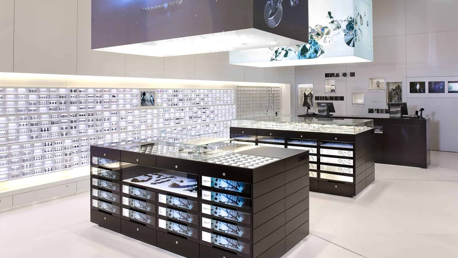
Swarovski Crystallized StoreEnvironmental Design

Peter Gregson Album CoversGraphic Design
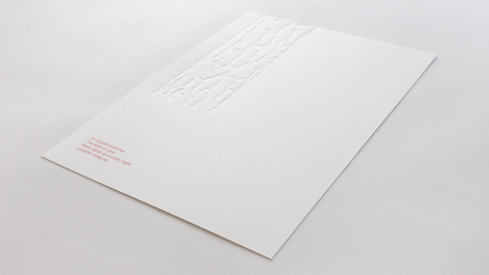
Sensory Holiday CardGraphic Design
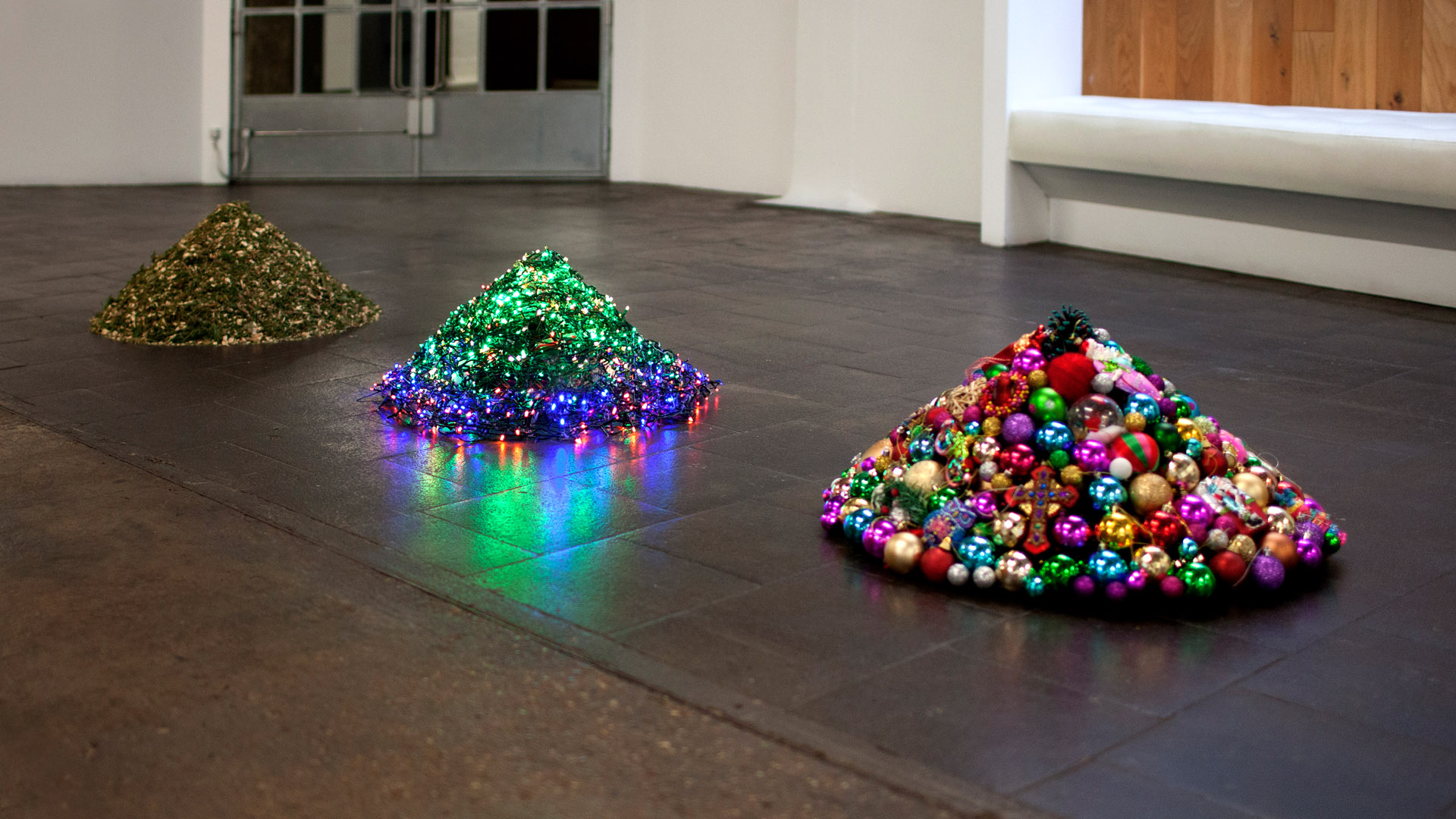
Decontstructed Christmas TreeGraphic Design
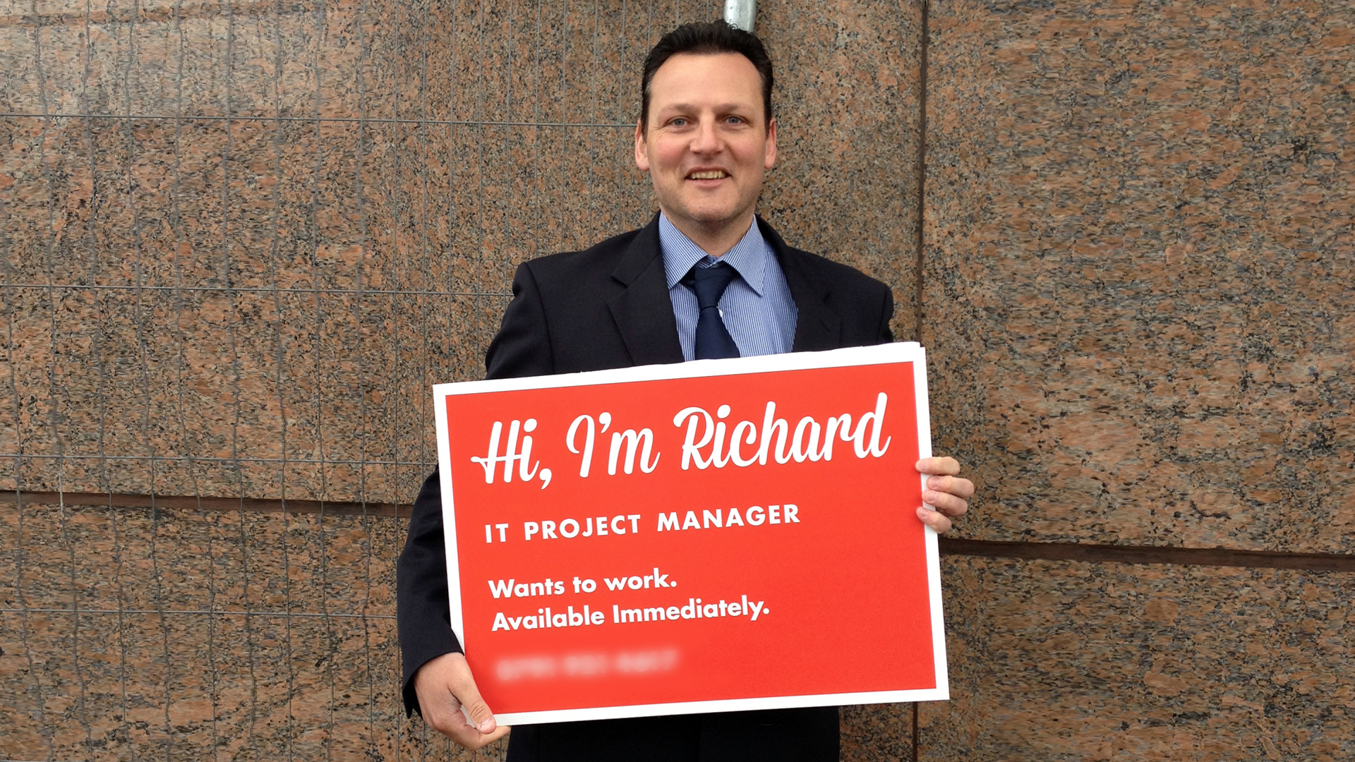
Richard's SignGraphic Design
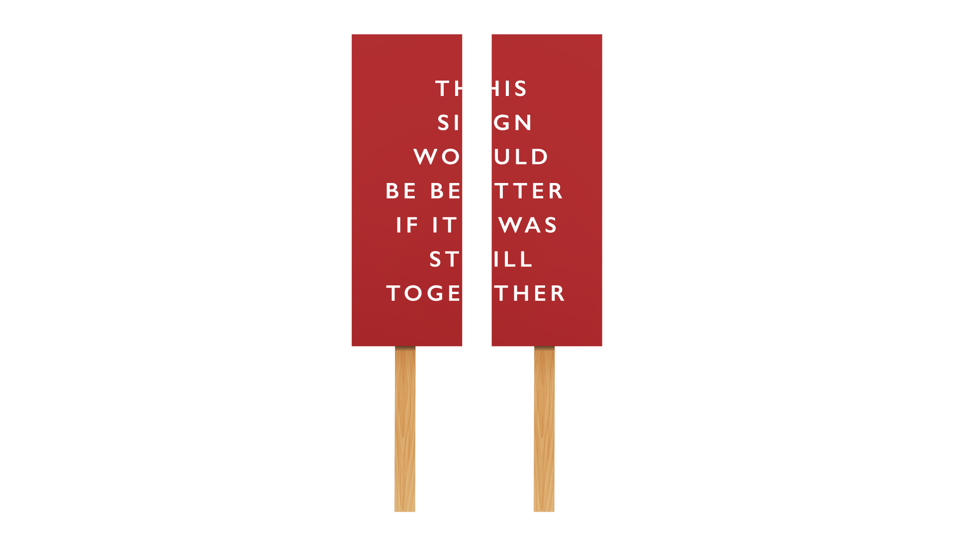
Anti Brexit protest signGraphic Design
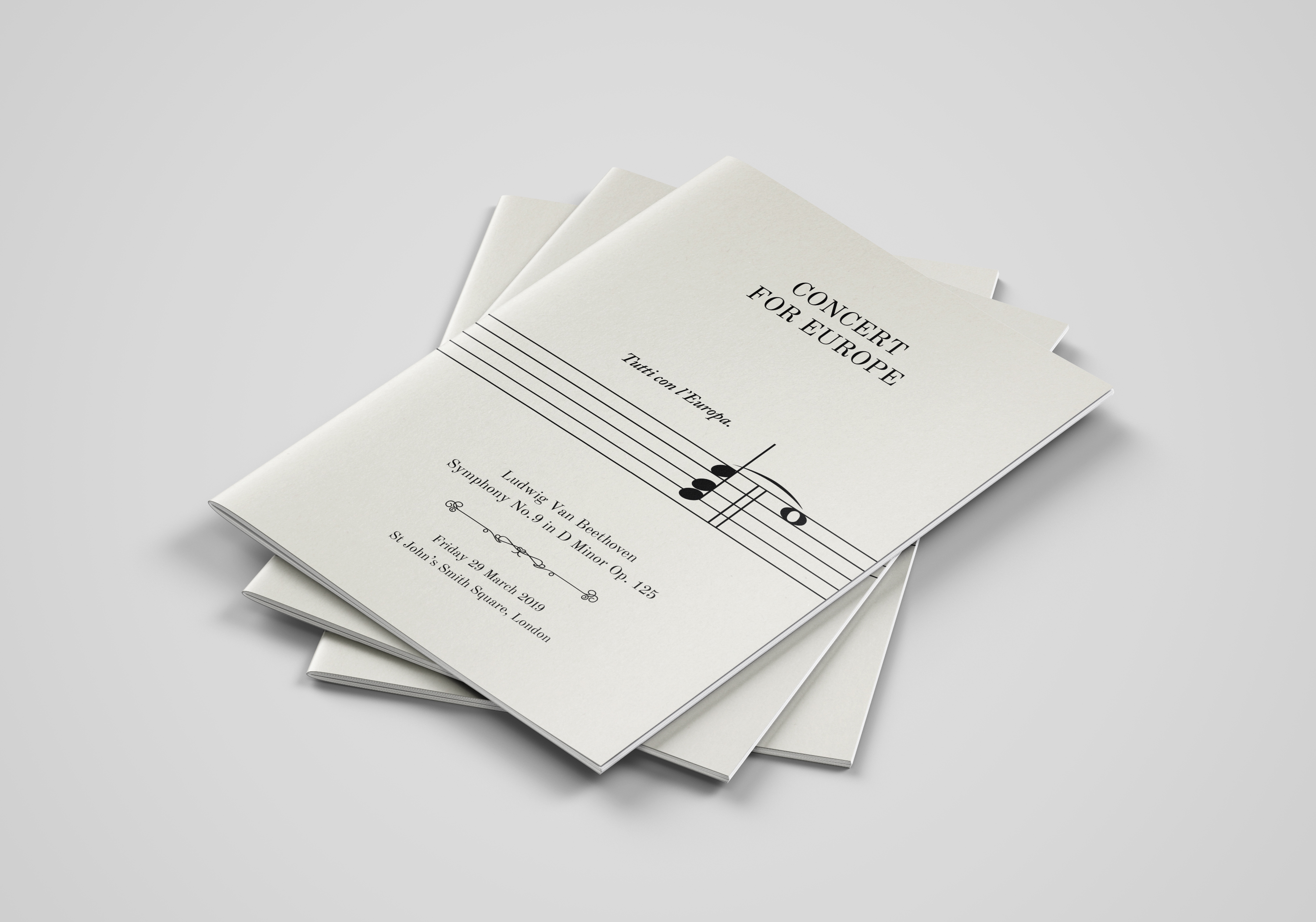
Concert for EuropeGraphic Design
Peace One DayBrand Design

Didot ThinlineGraphic Design
Ten Bells PubPhotography
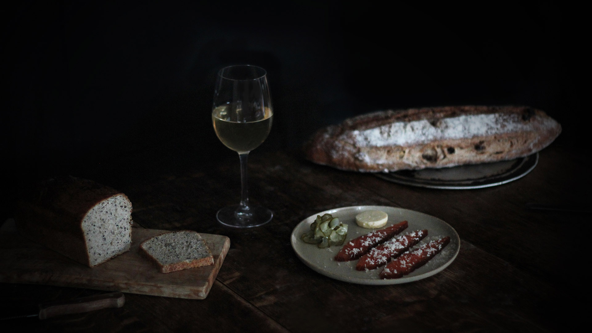
Method Supper ClubPhotography
Joshua Leigh
Contact
©2019