Nightingale
Experience Design
Medication adherence is one of the most persistent challenges facing our healthcare system today. In addition to the negative impact non-compliance has on people’s health, it is estimated that the NHS loses approximately £500m each year to it.
We set out to try and respond to this challenge through Nightingale — a speculative healthcare service that reminds people to take their medication in a more human way.
Fast Company – 'The World’s Best Medication Reminder May Be All Around You'
Year
2016
Studio
Method
My role
Lead Visual Designer
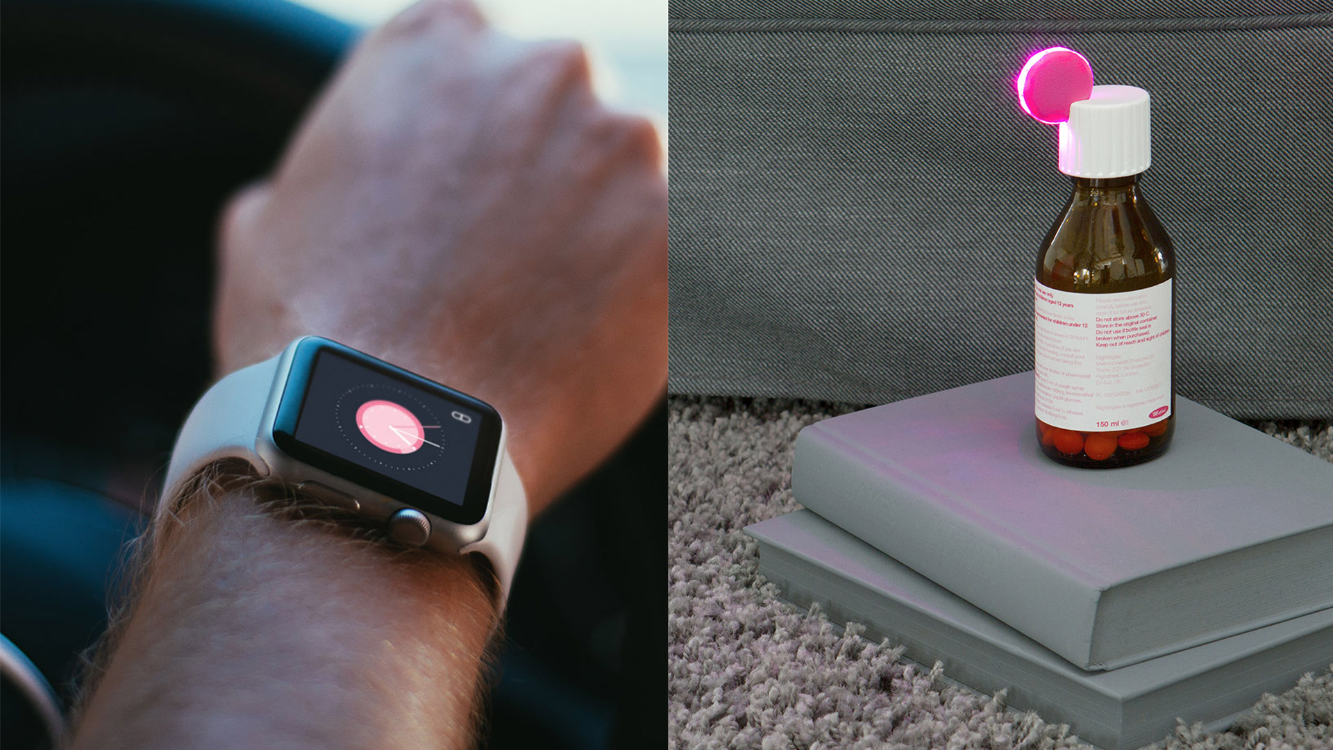
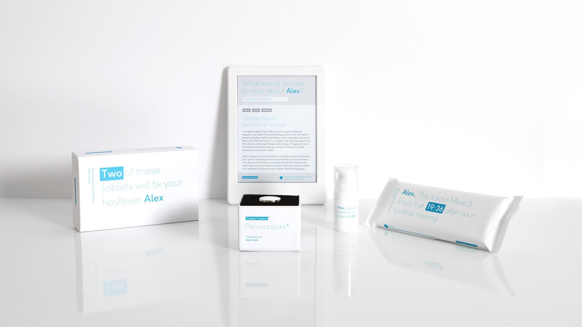
Powered by machine learning, Nightingale nudges patients to take their medication through distributed interfaces embedded in the everyday objects that surround them.
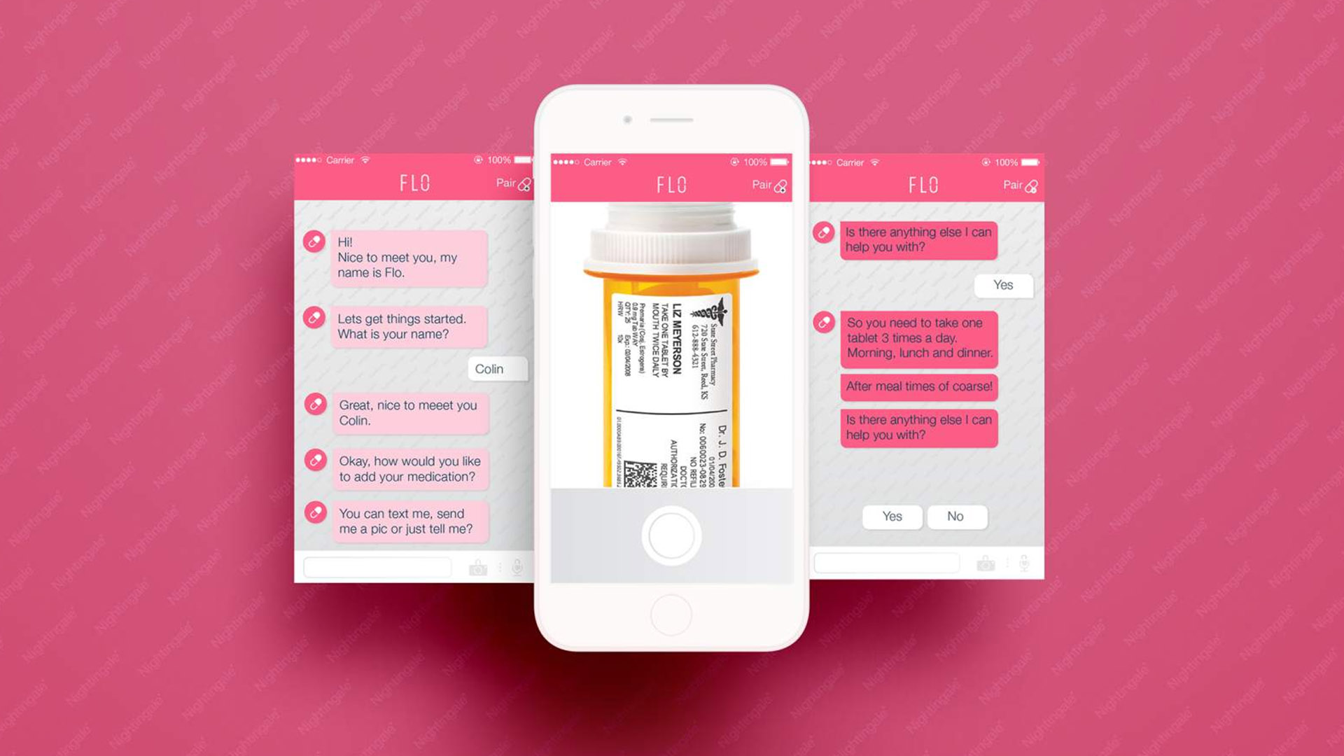
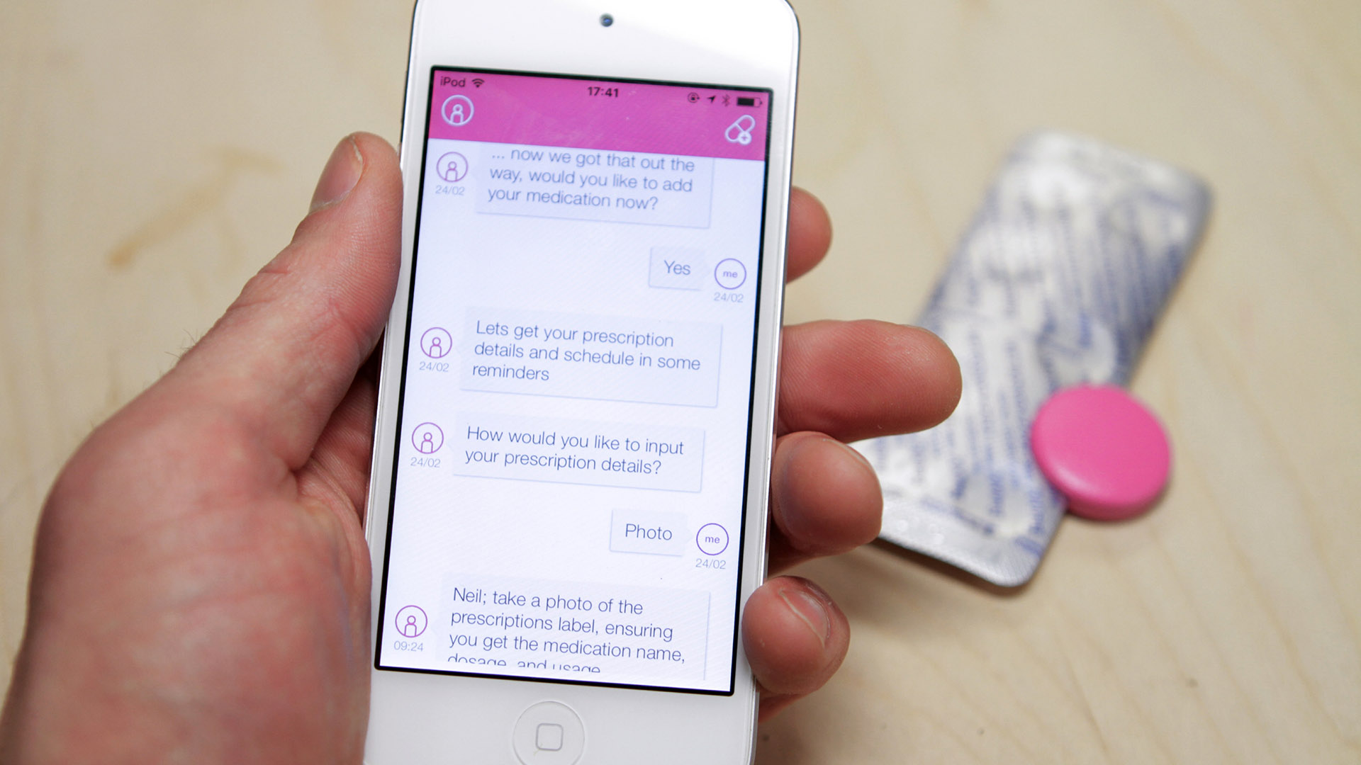
At the core of the service is FLO, a chatbot that provides contextual information and support. The ambition of the service is to help the patient adopt new behaviors in a less invasive manner.
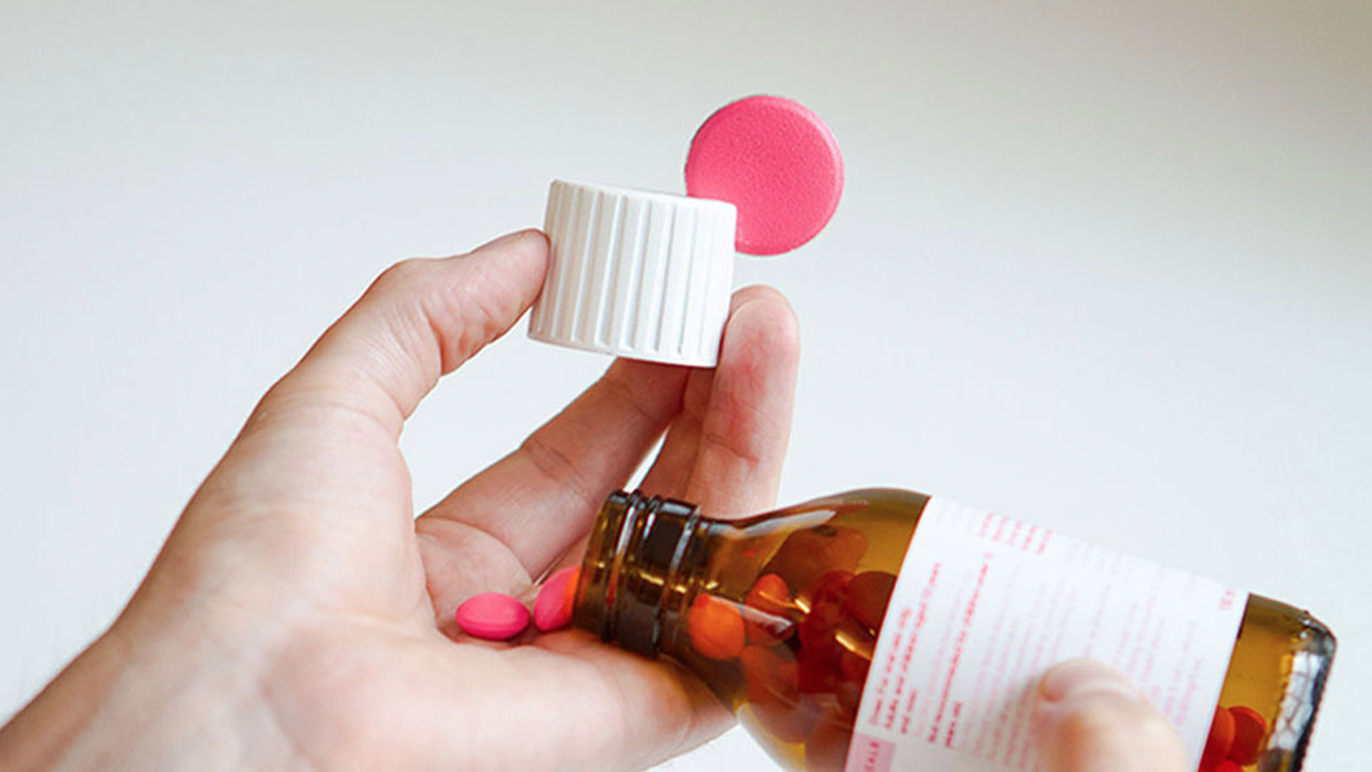
Nightingale understands the patient's medication schedule and sends reminders when medication is due to be taken. Alerts are delivered digitally through the patient's smart devices and physically through connected medical packaging.
Questions the patient may have about their medication can be answered by Flo through a conversational UI.
The patient receives simple, clear answers, removing the need to read through pages of complex instructions, potential side effects or drug interactions.
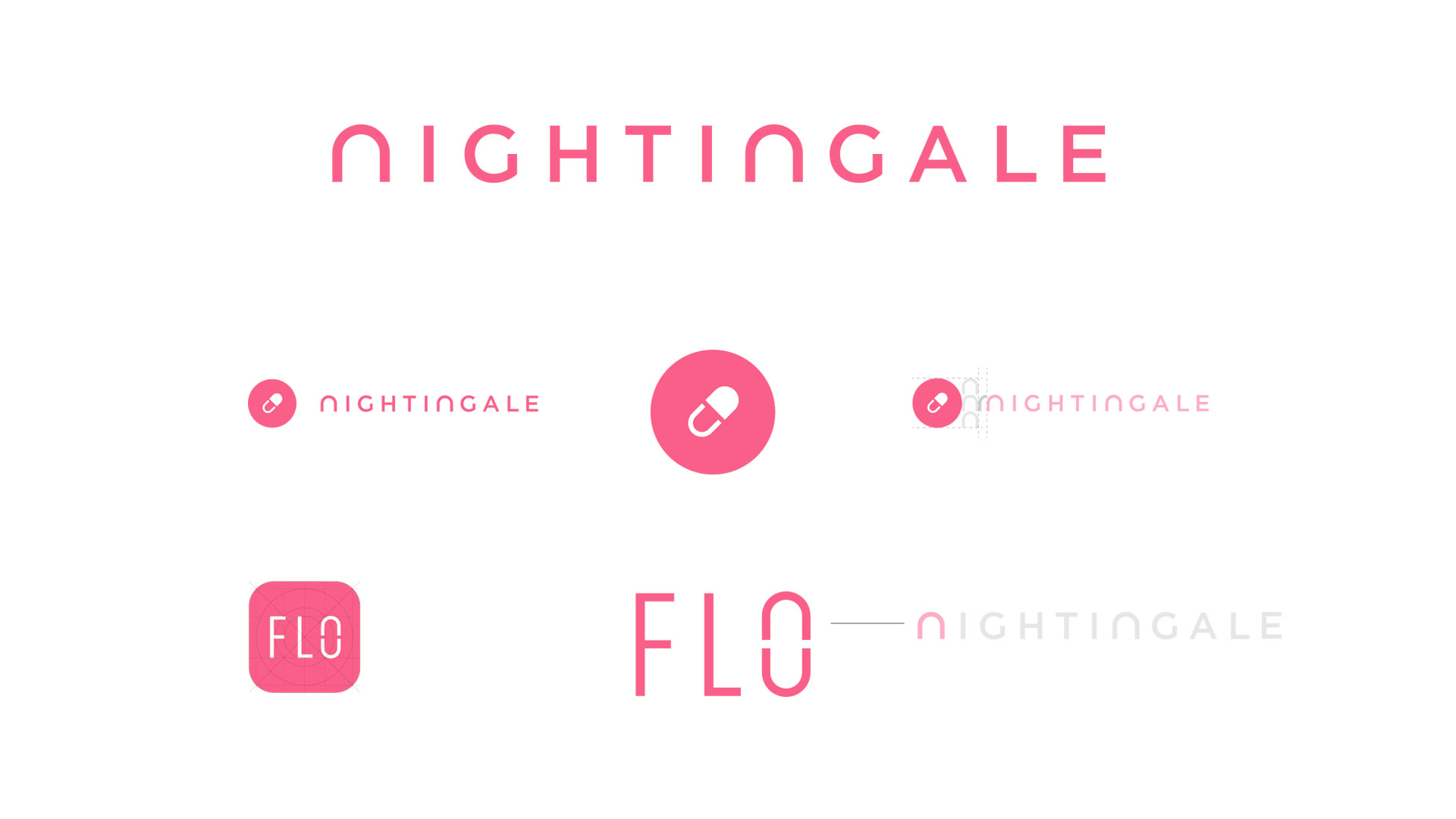
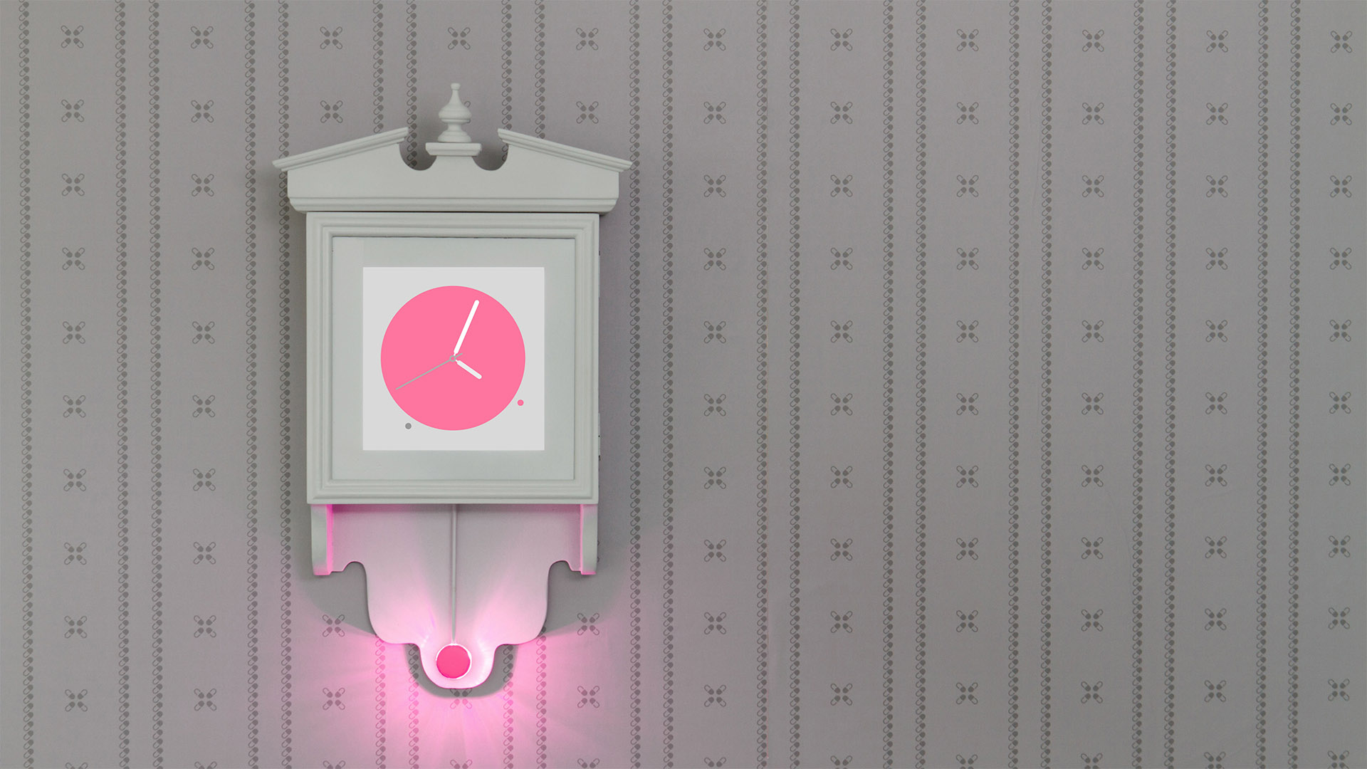
I designed the Nightingale and Flo brand identities to share a common visual language. The 'pill' symbol contains the 'n' form which is seen within the Nightingale wordmark. This same form is mirrored within the Flo wordmark. The bright pink colour was key to the brand, allowing the medication reminders and alerts to cut through the visual backdrop of everyday life. Nightingale is specifically designed to disrupt the user's activities and grab their attention.

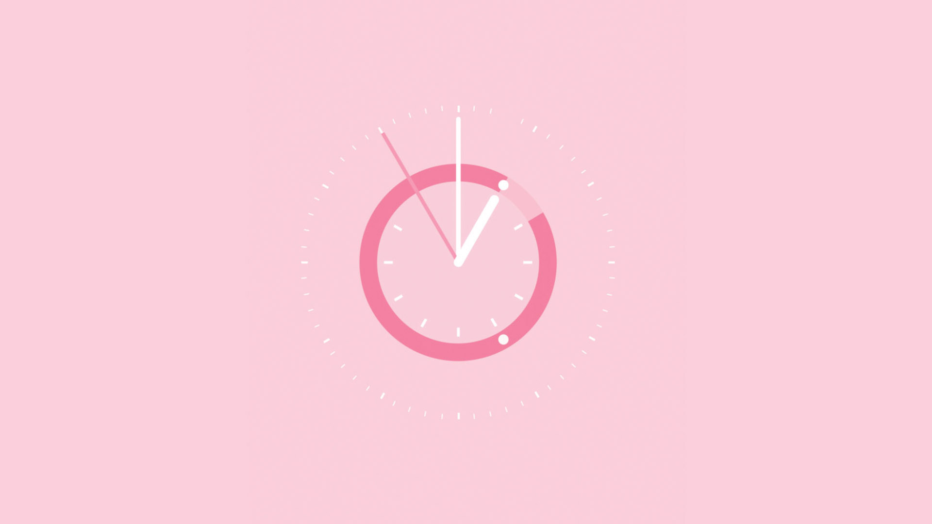
The Nightingale clock and watch face was designed to alert users of their upcoming doses and help them manage their time. Timing of medication is a challenge for many patients which, when poorly managed, can lead to a decrease in adherence. Timing can be complicated when taking a number of medications that require spacing throughout the day and around meal times.
Other projects
Roberts RadioResearch & Insights, Brand/Product Strategy
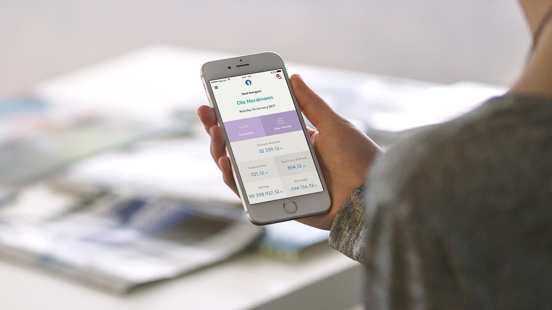
Gjensidige Mobile BankResearch & Insights, Product Design
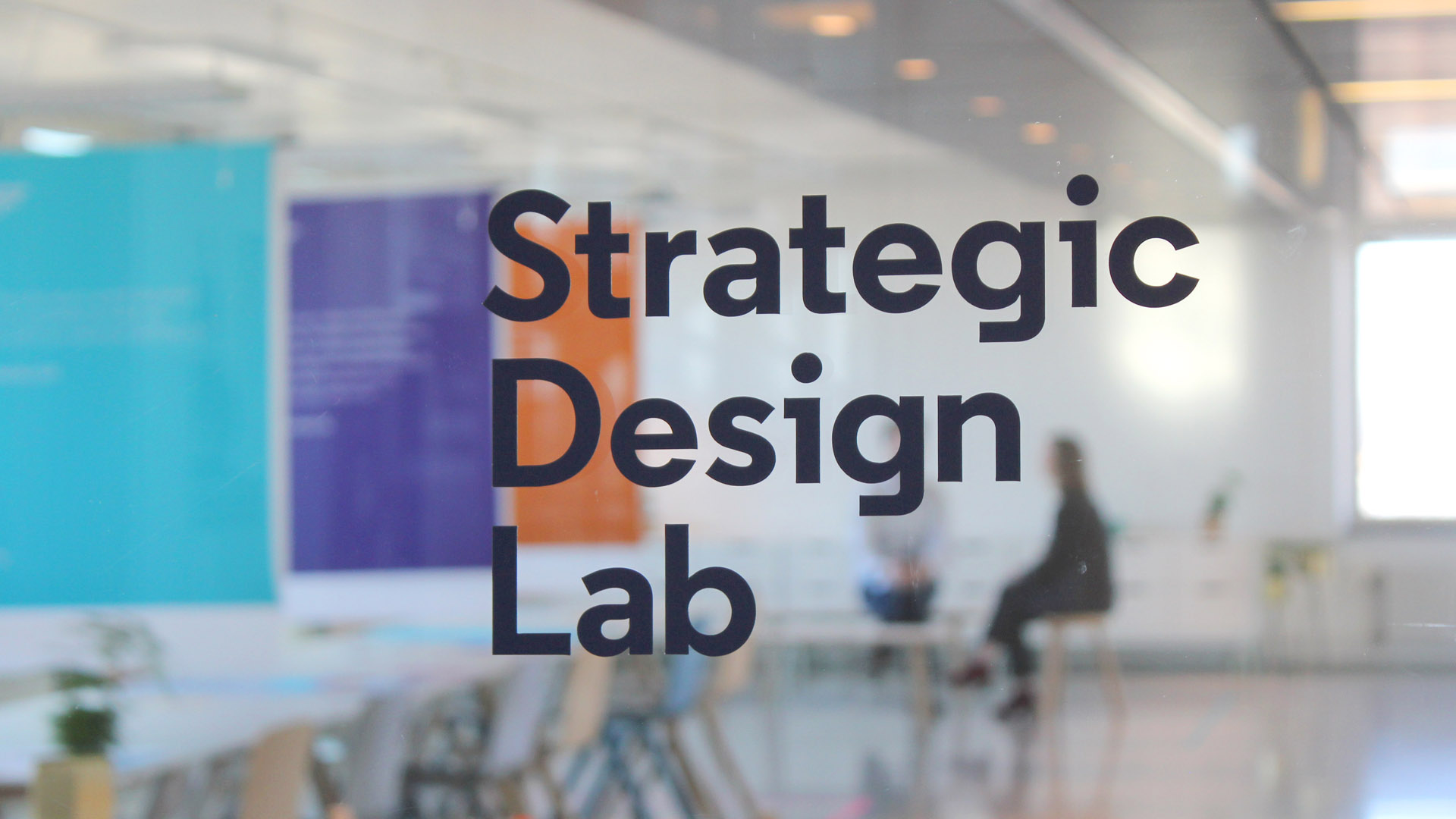
EVRY Strategic Design LabCapability building, Research & Insights
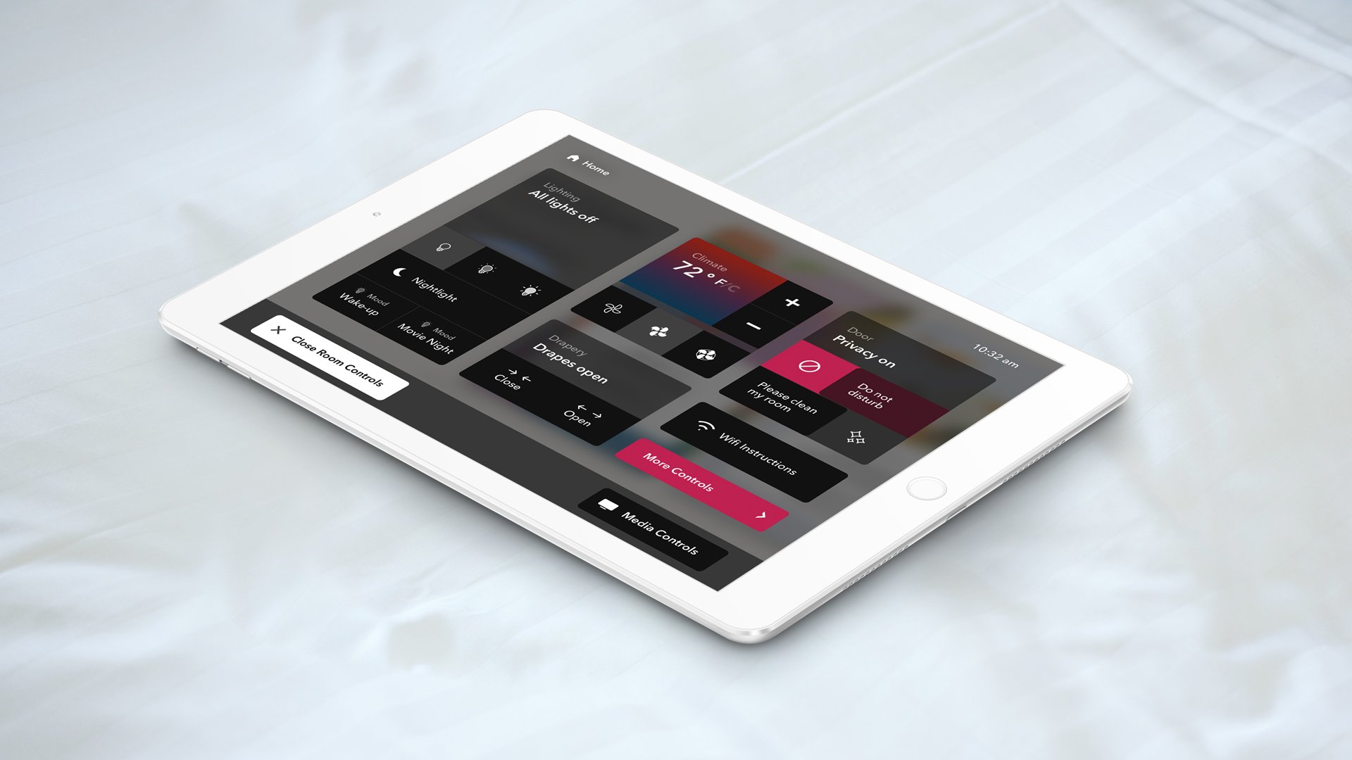
Wynn Resorts – In-room controlsExperience Design, Service Design
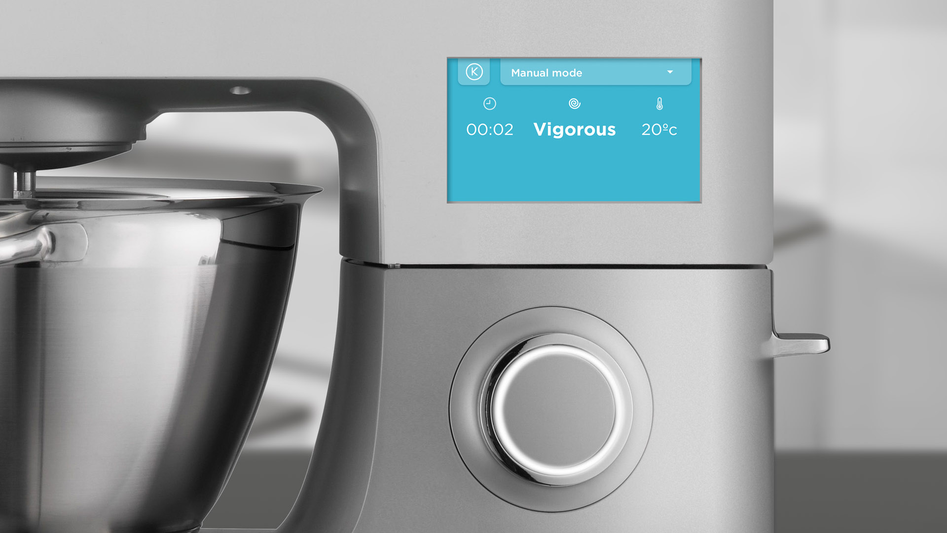
Kenwood Universal UIExperience Design
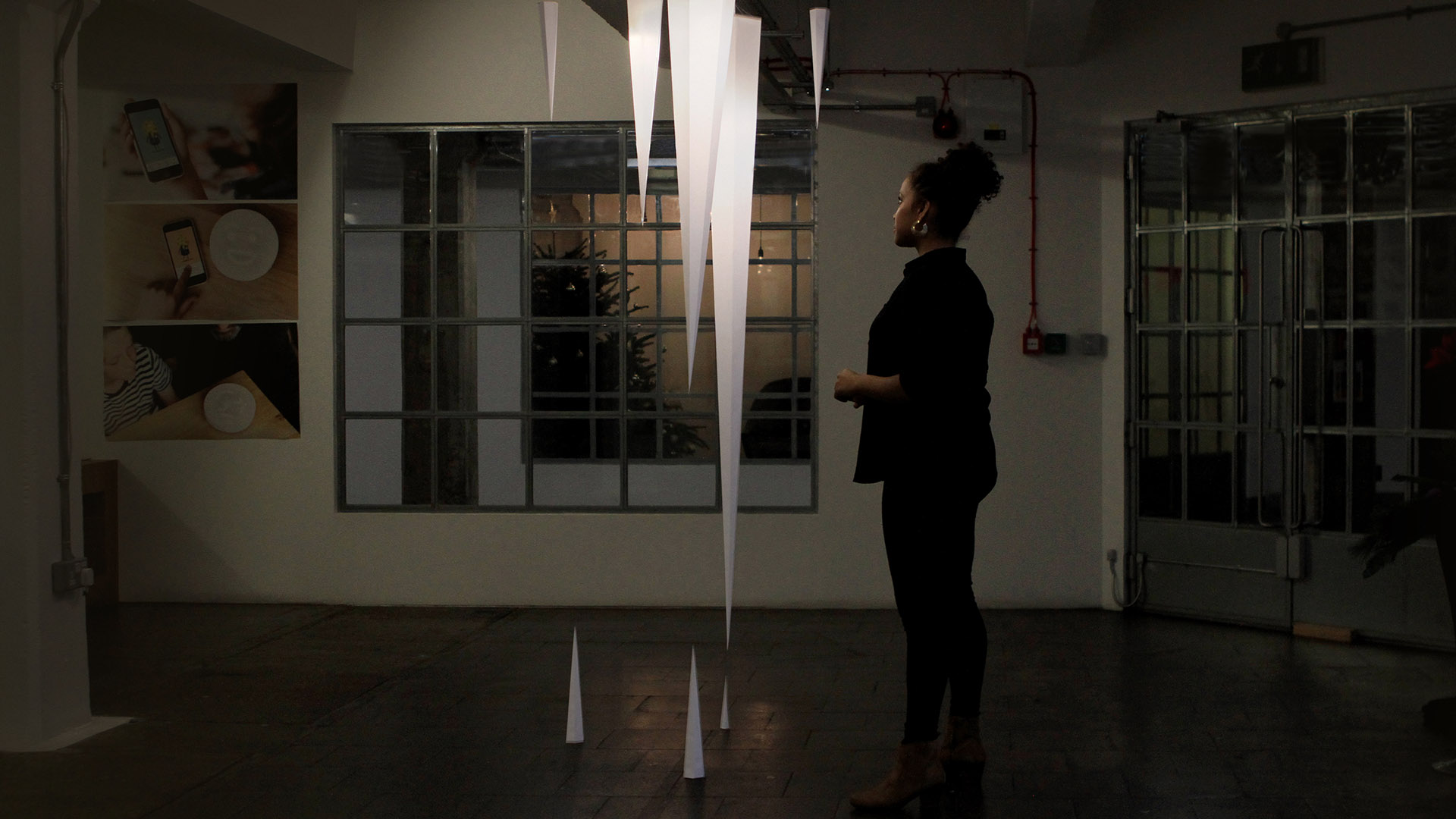
Method Icicle InstallationExperience Design
Hitachi – The Future of TrustSpeculative Design
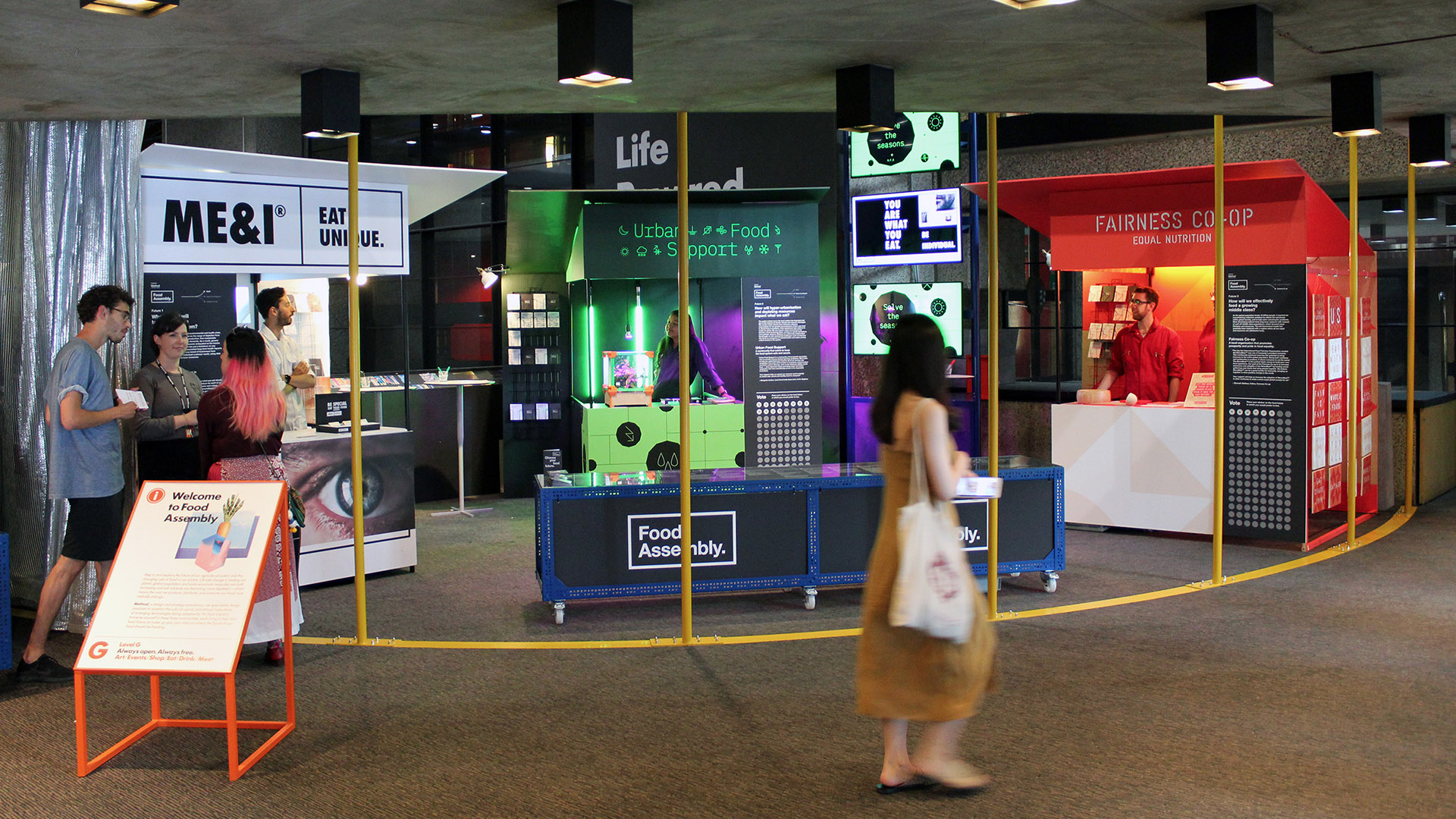
Barbican – The Future of FoodSpeculative Design

Dunhill Brand IdentityBrand Design

DAZN identBrand Design

UKTV BrandingBrand Design

51 Jay Street BrandingBrand Design
JW Marriott Venice F&BBrand Design

Freshfields Brand IdentityBrand Design
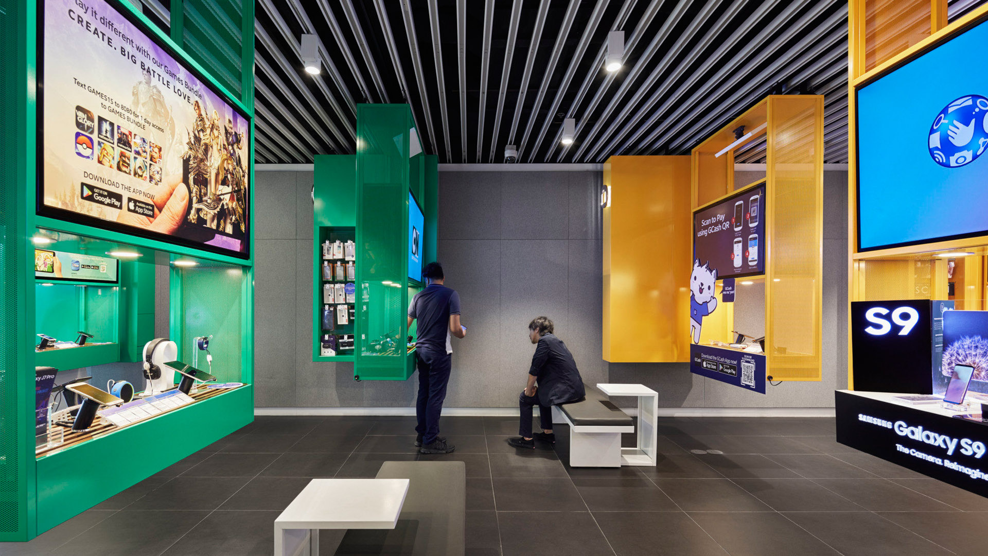
Globe Telecom Flagship storeEnvironmental Design
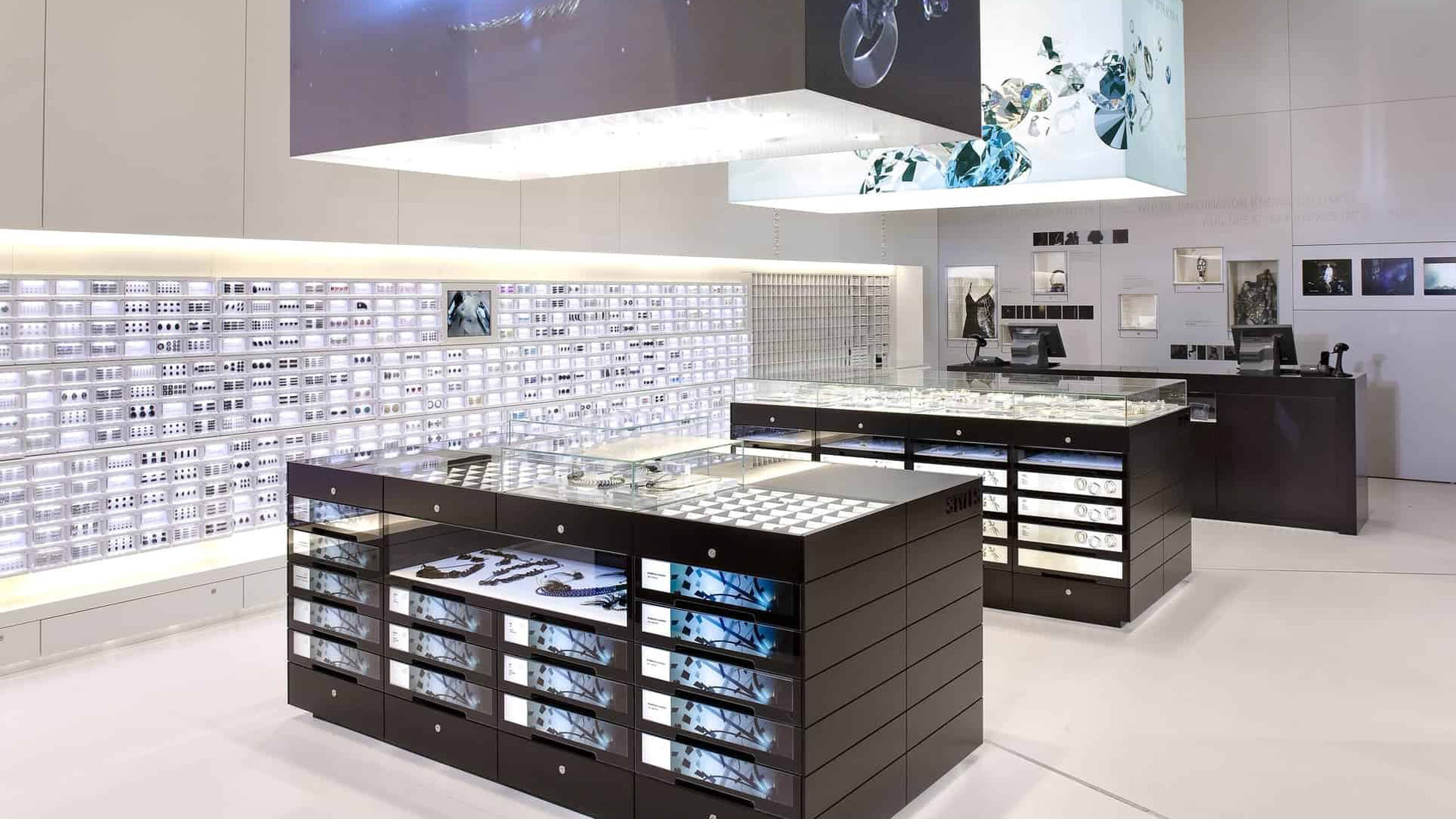
Swarovski Crystallized StoreEnvironmental Design

Peter Gregson Album CoversGraphic Design
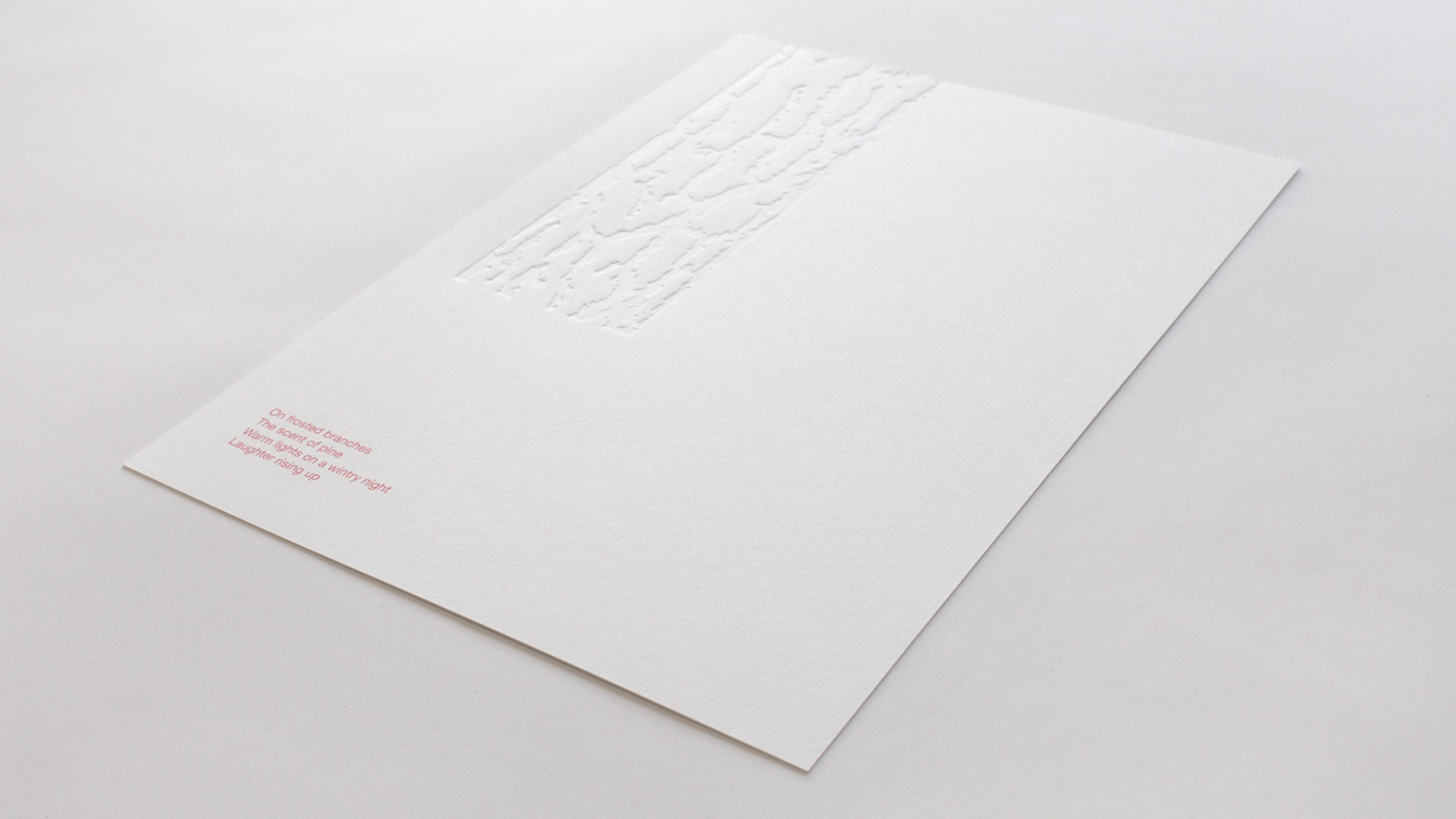
Sensory Holiday CardGraphic Design
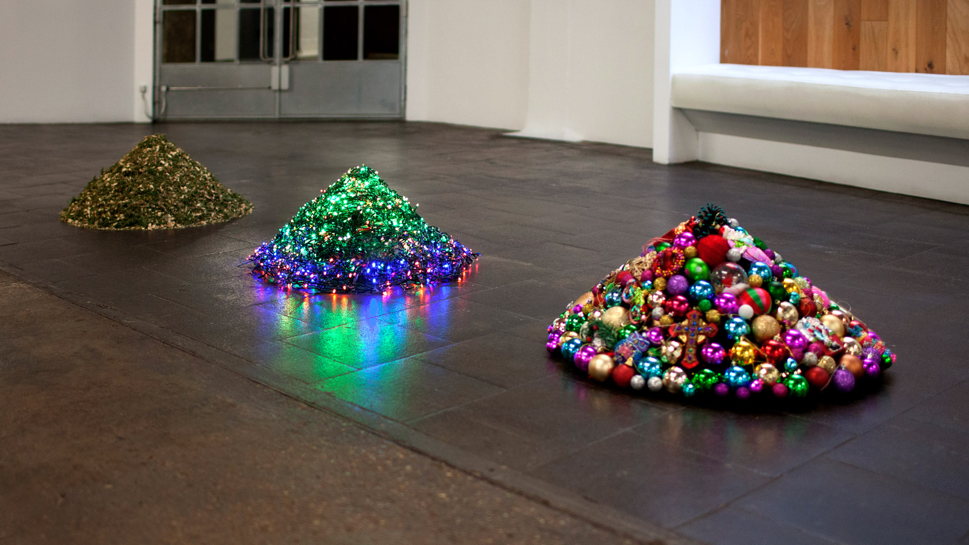
Decontstructed Christmas TreeGraphic Design
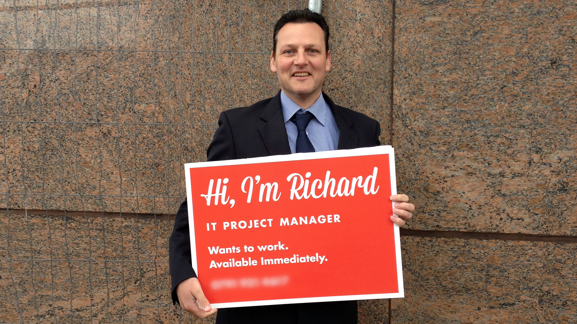
Richard's SignGraphic Design
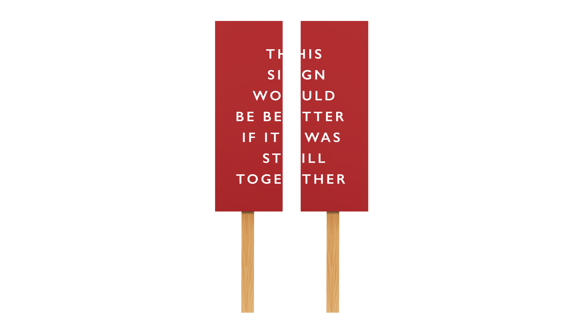
Anti Brexit protest signGraphic Design

Concert for EuropeGraphic Design
Peace One DayBrand Design
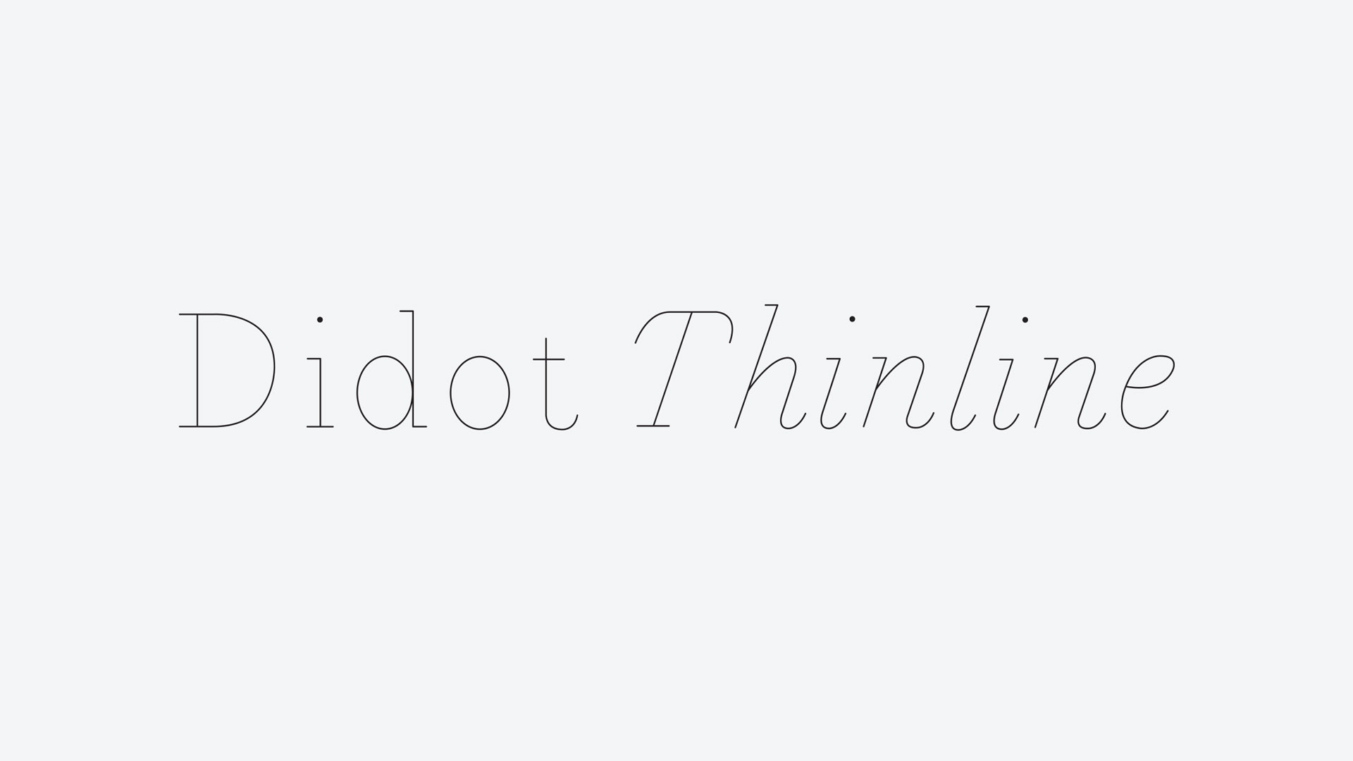
Didot ThinlineGraphic Design

Ten Bells PubPhotography
Method Supper ClubPhotography
Joshua Leigh
Contact
©2019